What's Layerpath?
Layerpath is an AI-powered platform designed to empower B2B product, sales, and marketing teams to create impactful, shareable demos in minutes. Record your screen, explain the steps, and Layerpath automatically transforms it into a polished step-by-step guide or video, seamlessly integrated with a Chrome extension.
The Problem
Layerpath faced a compound drop-off problem:
- 50% of users who signed up never downloaded the Chrome extension, which is required to use the product.
- Limited engagement on the dashboard: of those who did download, another significant portion never created their first project.
- Few users publish or share their created projects.
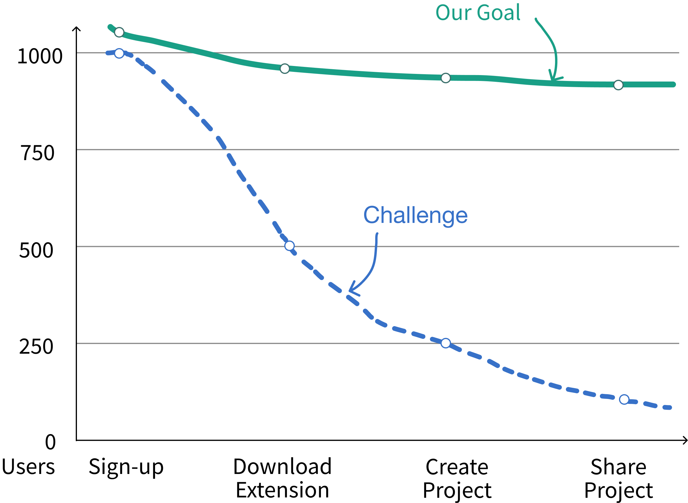
A Chrome extension is required to use Layerpath, but nearly half of users dropped off before installing it. Without understanding WHY users were abandoning the flow, Layerpath couldn't effectively support its product-led growth strategy.
In collaboration with the founder, we set success metrics to identify pain points causing the gap between sign-ups and downloads, develop a MVP to address these issues, and iterate designs based on user feedback.
While the team worked on competitive analysis, I led heuristic evaluations and user outreach. The founder provided a user list for recruitment. I reached out and got zero responses.
I expanded to our personal networks and recruited 6 product managers from small to mid-sized companies, Layerpath's target users, for usability testing. A teammate led the creation of the usability test script, while I conducted 5 of the 6 interviews.
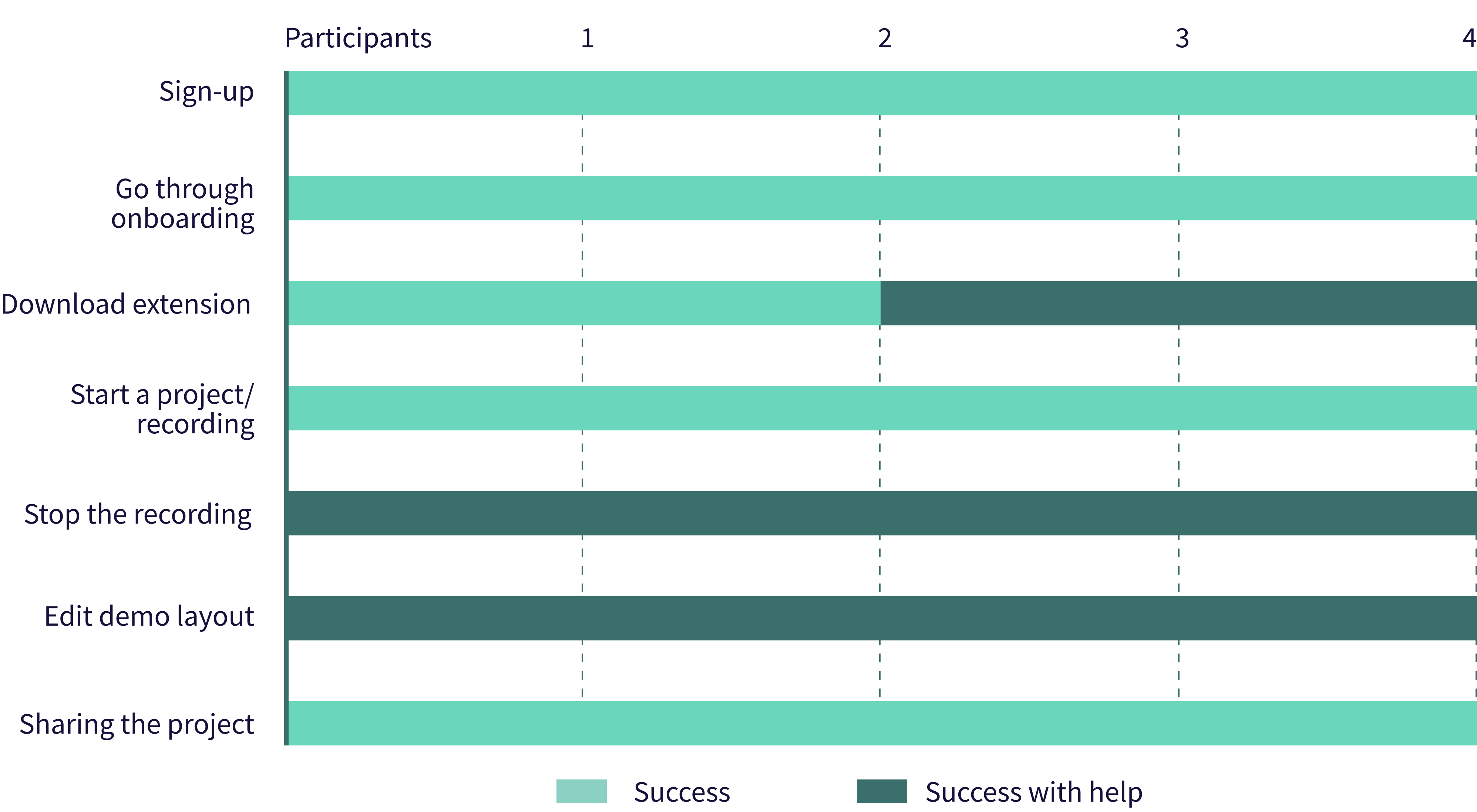
Usability tests with 4 users showed key drop-offs from signup to sharing. 2/4 struggled to download the extension, and most found recording and editing difficult. Why?
 Homepage
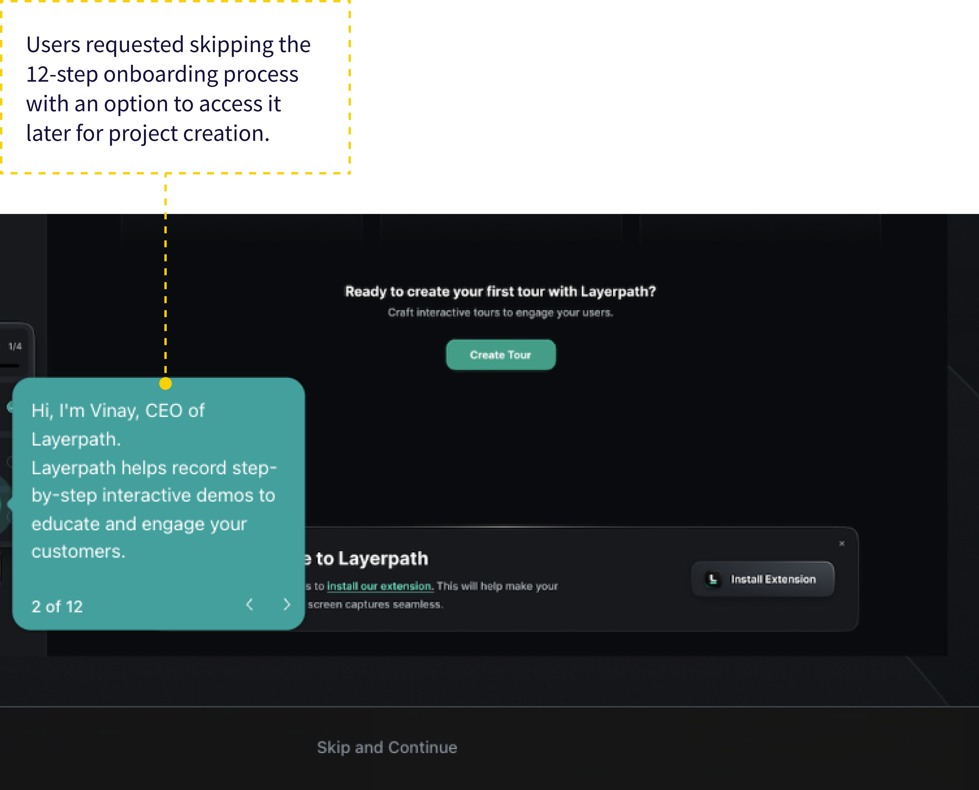 Onboarding after sign-up
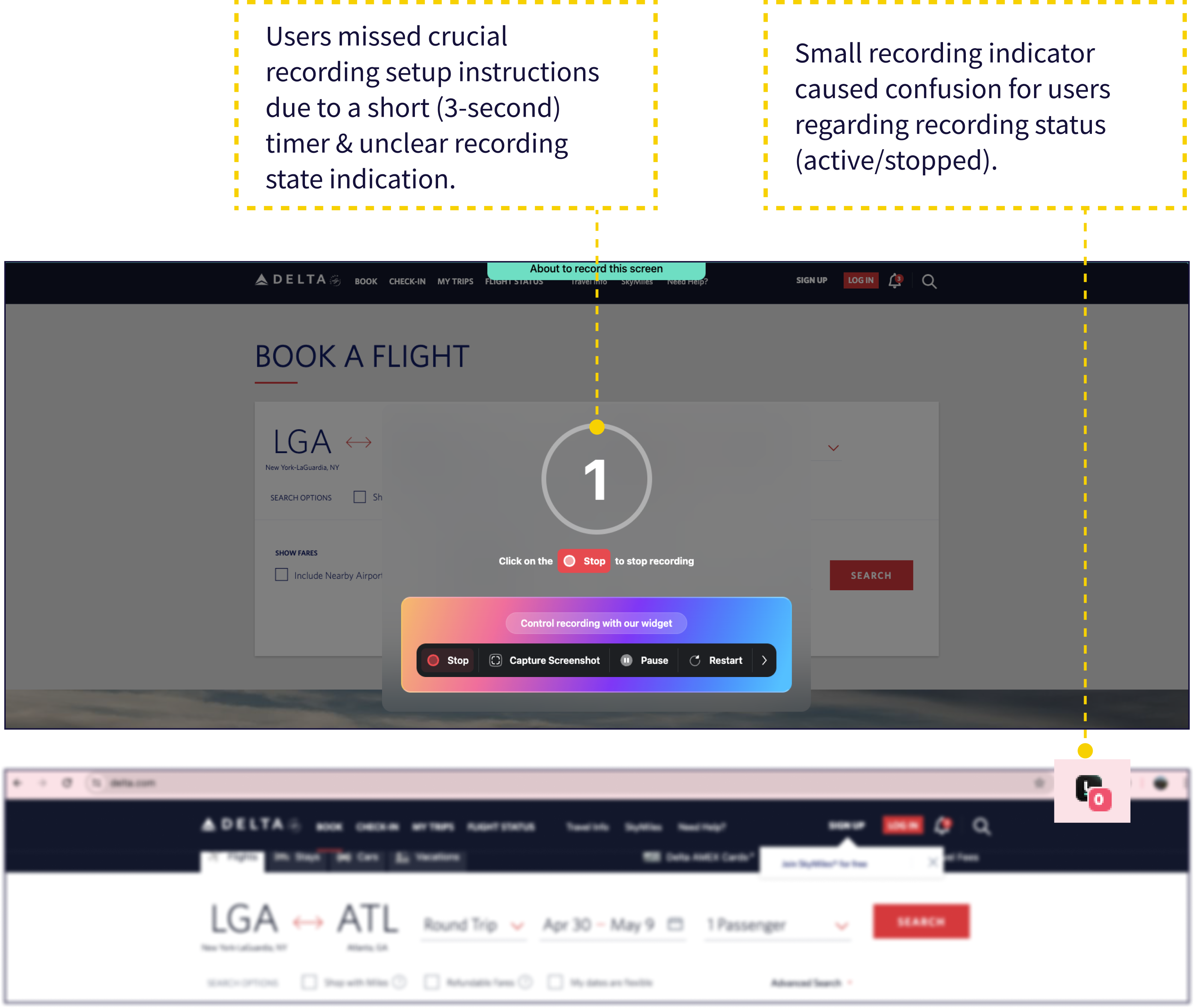 During the Recording
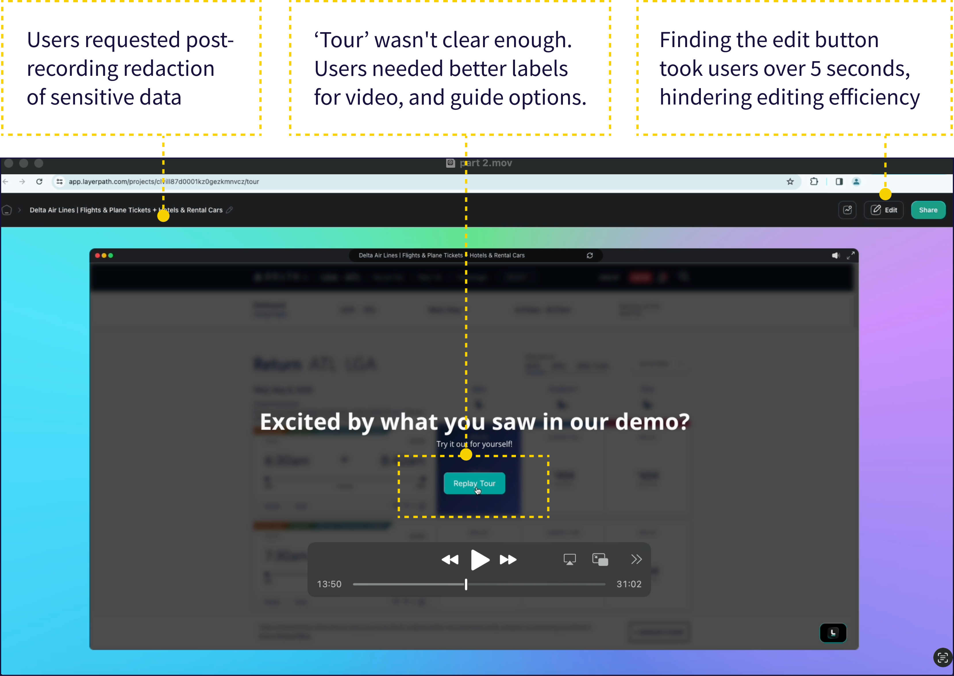 Editing post recording
We conducted task analyses of three competing demo tools to pinpoint areas where users might drop off.
 Privacy & Trust: All, except Layerpath, address privacy via a footer link.
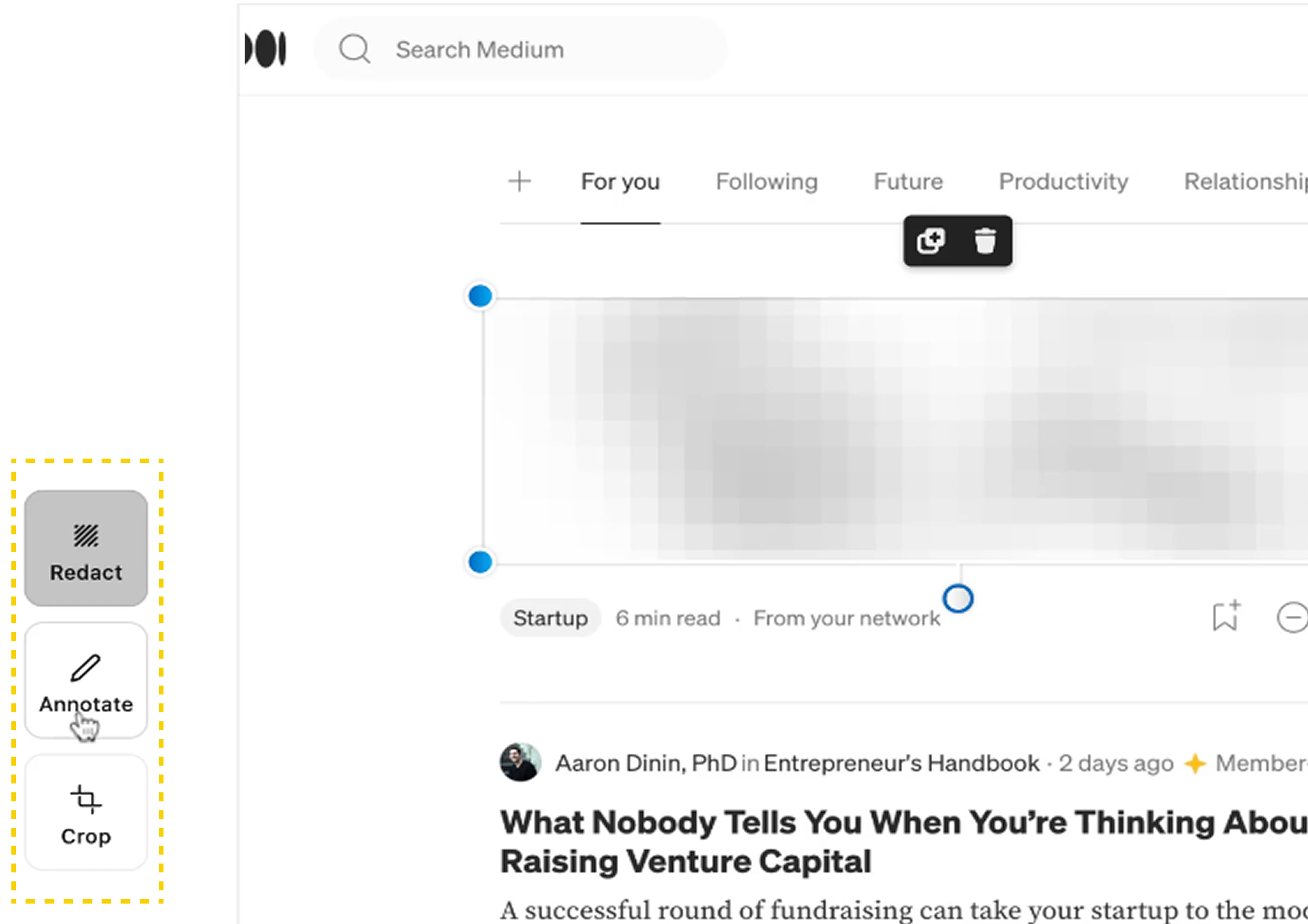 Recording Experience: Supademo is the only platform with a post-recording tool to redact and crop sensitive data.
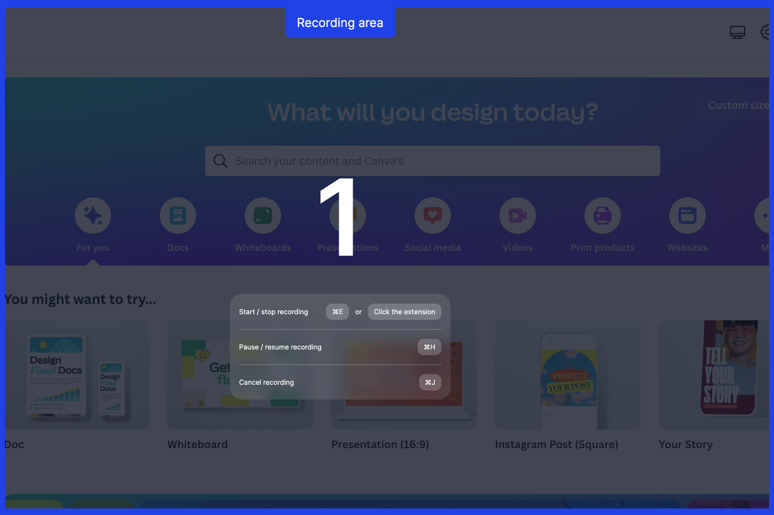 Recording Experience: Arcade offers clear recording controls (start / pause / stop) and recording area indication.
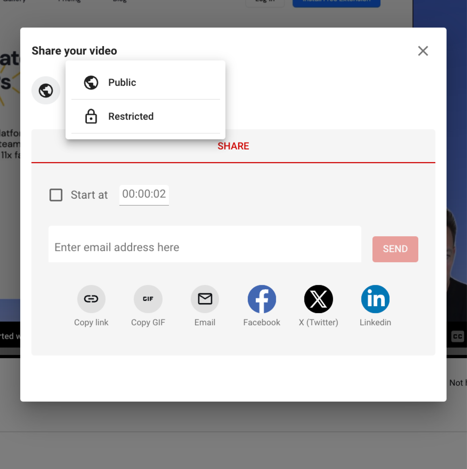 Sharing Controls: Most offer public and restricted sharing options for demos.
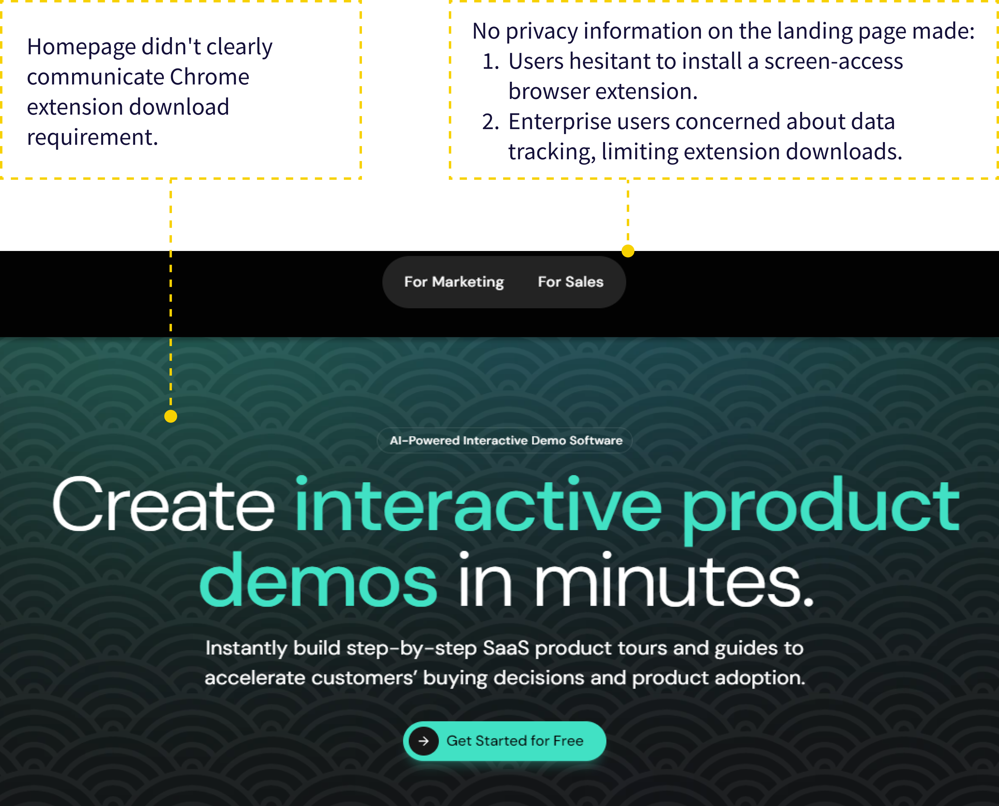
Privacy and data security concerns create trust barriers in the browser extension space. Most users hesitated to install without clear, visible information on data access and permissions.
How might we build trust and confidence during the extension download step?
I facilitated a design thinking workshop with the team to translate research findings into design decisions. We used an impact-effort matrix to define an MVP for the remaining 2 weeks.
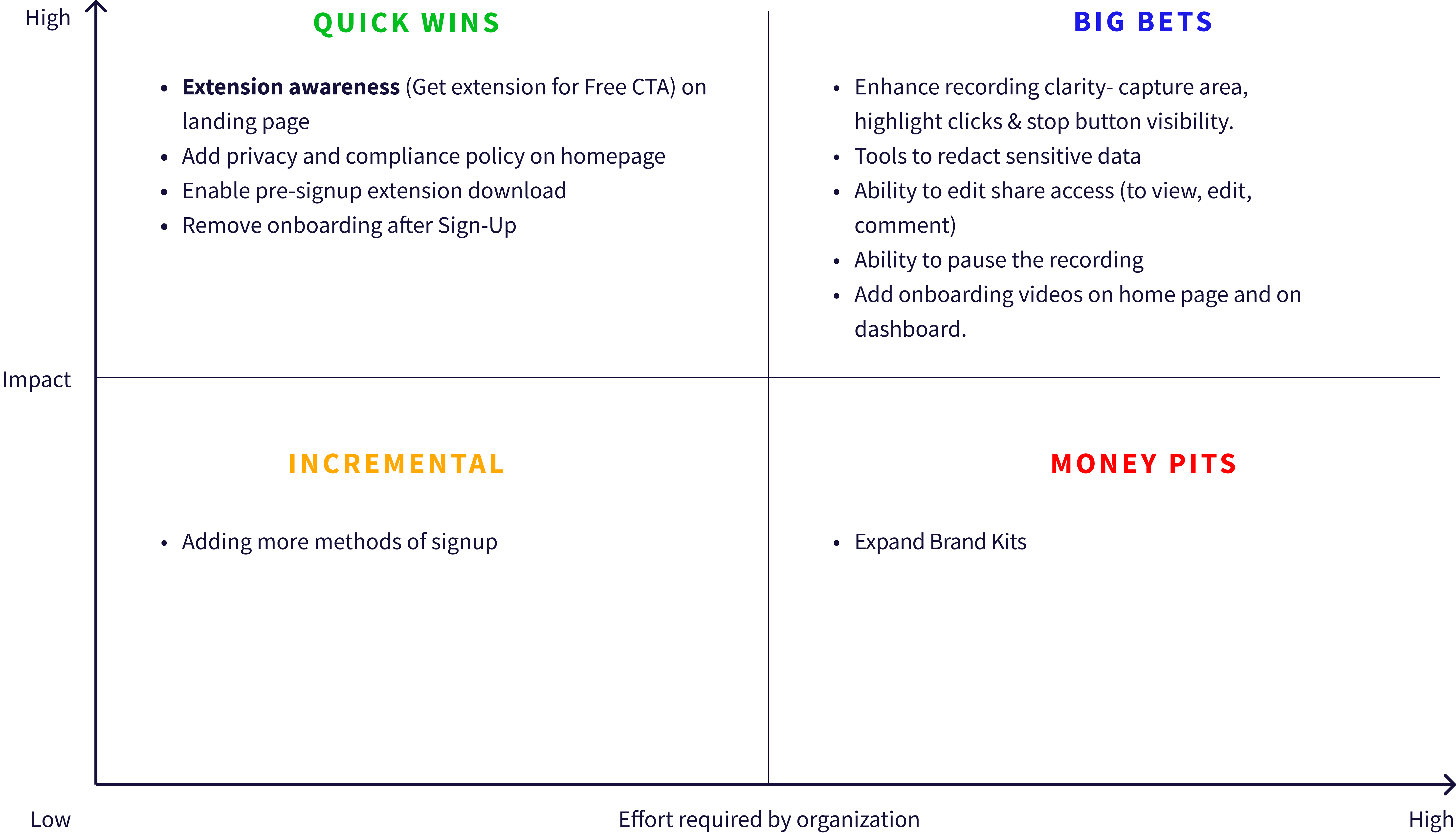
Based on impact vs. effort and the goal of reducing drop-off, we prioritized five key solutions:
- Chrome Extension Awareness on Homepage: Make the extension requirement visible upfront and eliminate trust-breaking surprise after sign-up.
- Enable Pre-signup Extension Download: Let users download the extension first, verify it's legitimate, inspect permissions, then decide whether to commit personal information.
- Privacy & Compliance: Visible privacy policy link addressing data handling and extension permissions tackles concerns about browser data access.
- Streamlined Onboarding: Short videos on the homepage and dashboard replacing the lengthy post-signup process.
- Improved Recording Experience: Ability to control the screen scope before recording and a redaction tool for editing sensitive information.
Enabling pre-signup extension download required a completely new user flow.
Key changes from existing flow:
- Users can download extension from homepage without signing up.
- Decision point: Install extension OR sign up first (user's choice).
- Dashboard checks for extension; prompts download if not installed.
Insights from user research shifted our focus to building trust earlier in the journey, shaping feature priorities and introducing a more flexible onboarding flow.
We ran moderated usability tests via Maze at low, mid, and high fidelity. Users appreciated the extension transparency immediately.
 Users were unsure if recording had started due to a lack of clear feedback. Adding a highlighted border and a click counter provided real-time confirmation and improved confidence during recording.
 Before: Homepage lacked Chrome extension info and a pre-signup download option.
 After: New homepage includes a clear CTA for Chrome extension awareness and enables pre-signup download.
- Pre-signup download enabled and clear CTA raises Chrome extension awareness.
- Prominent privacy policy link addresses data security concerns (also to be incorporated in the new header's Resources tab).
- Streamlined onboarding: Informative videos on homepage & dashboard replace lengthy post-signup process.
- Previously, users couldn't download the Chrome extension until signup, creating a signup and extension download hurdle.
- Now, they can download first, reducing friction and building trust before signup.
 If a user signs up without the Chrome extension, the dashboard detects this and prompts them to download it.
- Clicking "Create a Project" reveals a clear "Start Recording" button.
- Three clear and concise instructions appear upon initiating recording, ensuring users understand the process.
- A red border highlights the screen area being recorded for user confirmation.
- During recording, a real-time step counter next to the Layerpath icon displays the captured steps. The Layerpath extension icon serves as a central hub for pausing or stopping recording through a user-friendly dropdown menu.
Usability and trust improved significantly post-redesign, with 4.8/5 ease-of-use and 4.6/5 likelihood-to-use ratings. Transparency around extension requirements and visible privacy policies reduced key adoption barriers.
Strong usability test results led to the redesign being implemented on the client's live website. Since launch, the experience has continued to evolve through ongoing iterations informed by business priorities and user data.
What our redesign achieved:

50% WAU increase
Post-implementation analytics showed weekly active users grew from ~110 to 165 within 3 weeks of launch.
4.8/5 ease of use
Prototype testing showed high usability and strong likelihood of use (4.6/5 intent-to-use).
Shipped in 2 weeks
The redesign was implemented on the live website within 2 weeks of delivery.
What the founder said:
"Richa worked with me to improve Layerpath's UX/UI. She jumped right in, understood the challenges and the audience, and her user research was top-notch. Her leadership and teamwork kept us all motivated and focused. She's got a knack for asking the right questions, which helped us refine the user experience and spot potential issues early on."
Learnings and Reflections:
- User research surfaced privacy concerns as a key barrier to extension adoption. I presented direct user quotes to the founder, which shifted priorities and led to privacy transparency being included in the MVP scope.
- Leading a team under tight deadlines required making decisions with incomplete information. Working closely with the founder, Vinay, I prioritized key insights and moved quickly from research into decision-making and iteration, leading the project end-to-end across strategy, research, ideation, and final delivery.
- It was tempting to redesign the entire experience upfront. However, user research pointed to a simpler solution: allowing users to understand and access the Chrome extension before committing. We implemented this through a clear call to action and a pre-signup download option in the flow.