
Web-app Navigation redesign
Introduction
Project Overview
I redesigned Abulé’s navigation for desktop and mobile to enable scaling from 1 to 100+ communities, creating a persistent structure with elevated discovery that informed product direction and powered a sales prototype that converted 7 prospects.
My Role & Focus:
Product Designer on a cross-functional team.
Synthesized research, defined design principles & IA, and designed solutions balancing user needs with 2-week timeline constraints.
Timeline
Nov- Dec 2024
Tools
Figjam, Figma, Linear, Microsoft Teams
TL;DR
Challenge: Support 3 levels of hierarchy (Community > Groups > Features) within limited real estate across desktop and mobile, while elevating community discovery without creating cognitive overload for time-strapped parents.
Solution: A scalable navigation system for desktop and mobile with elevated community discovery while isolating high-level navigation from contextual tasks.
Impact: Drove core product development, designed scalable growth with a modular supporting ‘N’ number of communities and multiple user roles across desktop and mobile browsers, and enabled sales success.
What’s Abulé?
Currently a seed-stage company, Abulé is a care-tech startup disrupting the $648B care industry. It is a platform for parents to connect with support networks & communities.
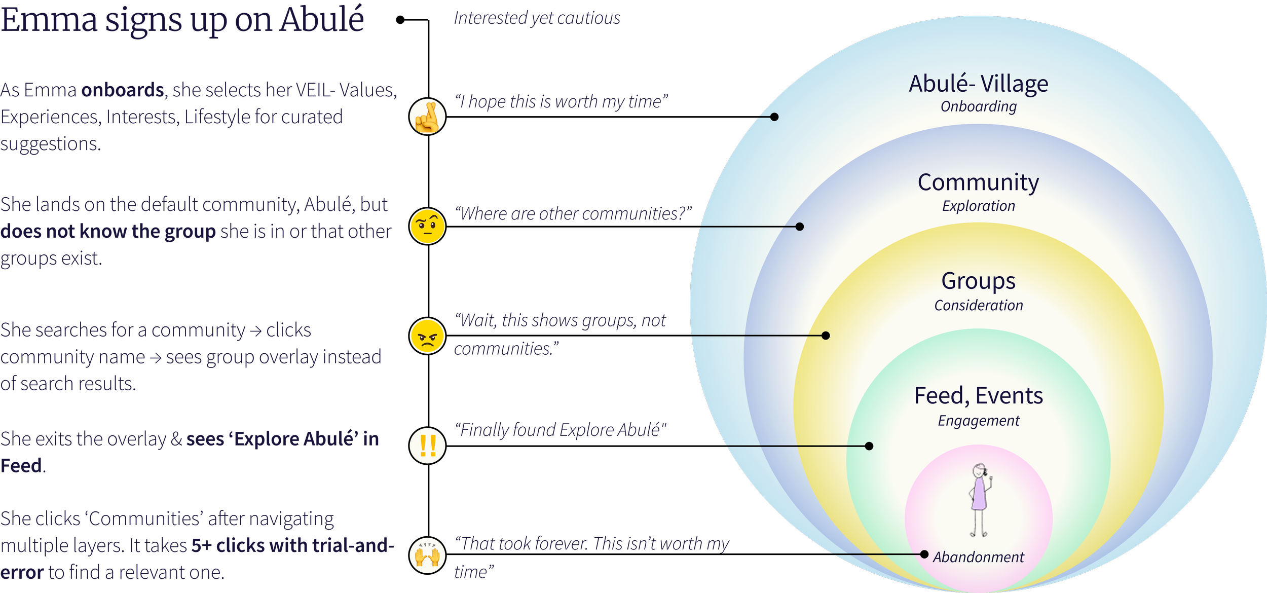
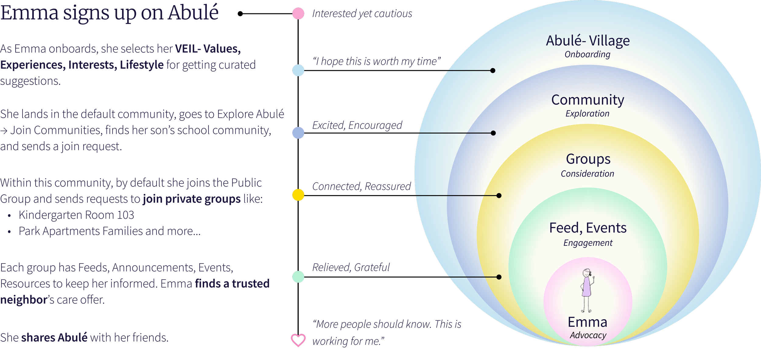
Let’s meet Emma, mom of 2, just relocated
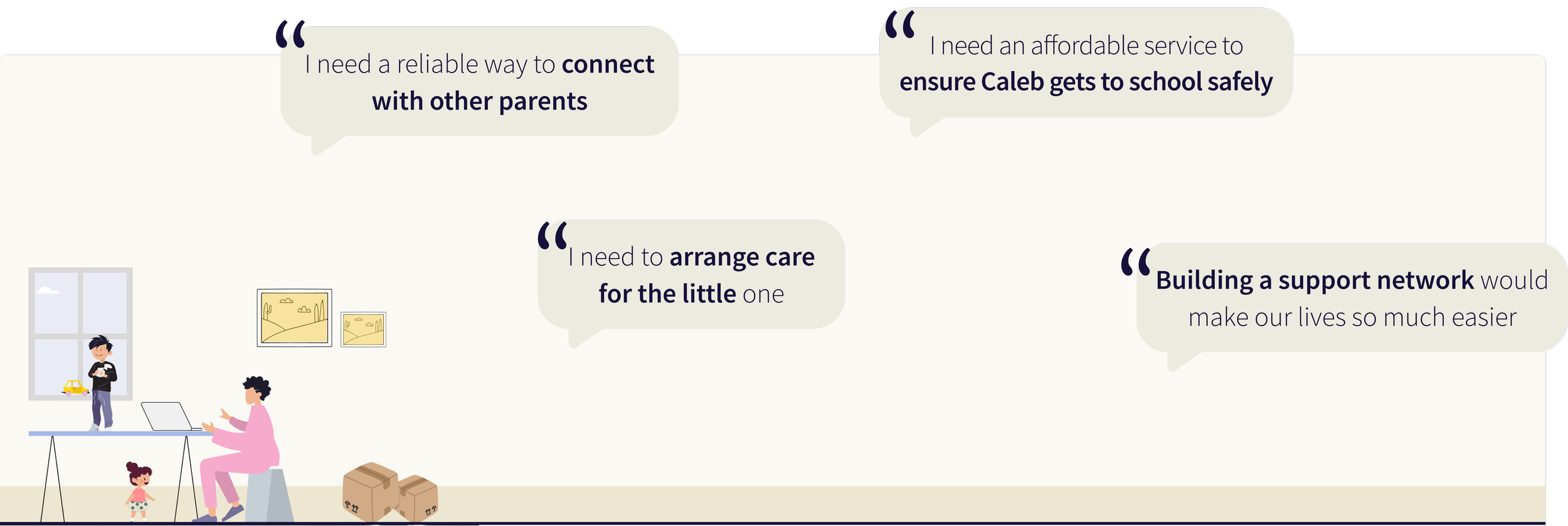
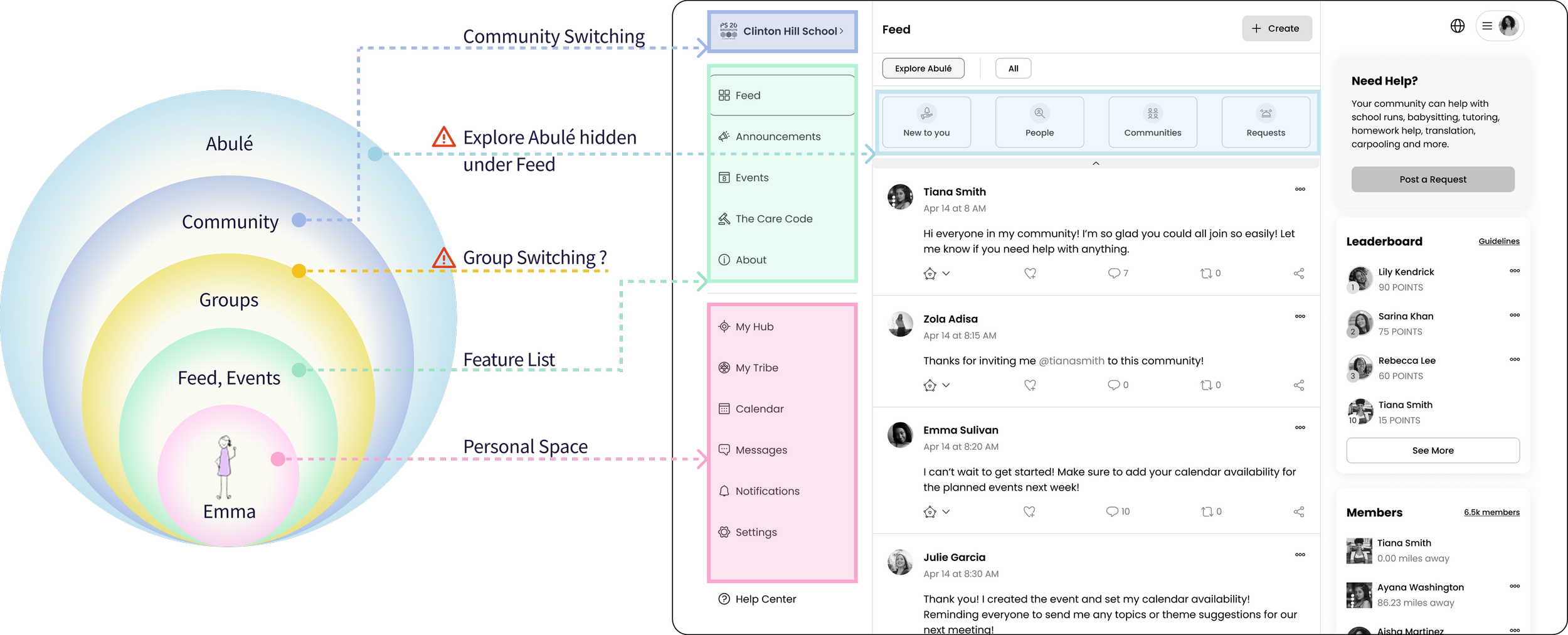
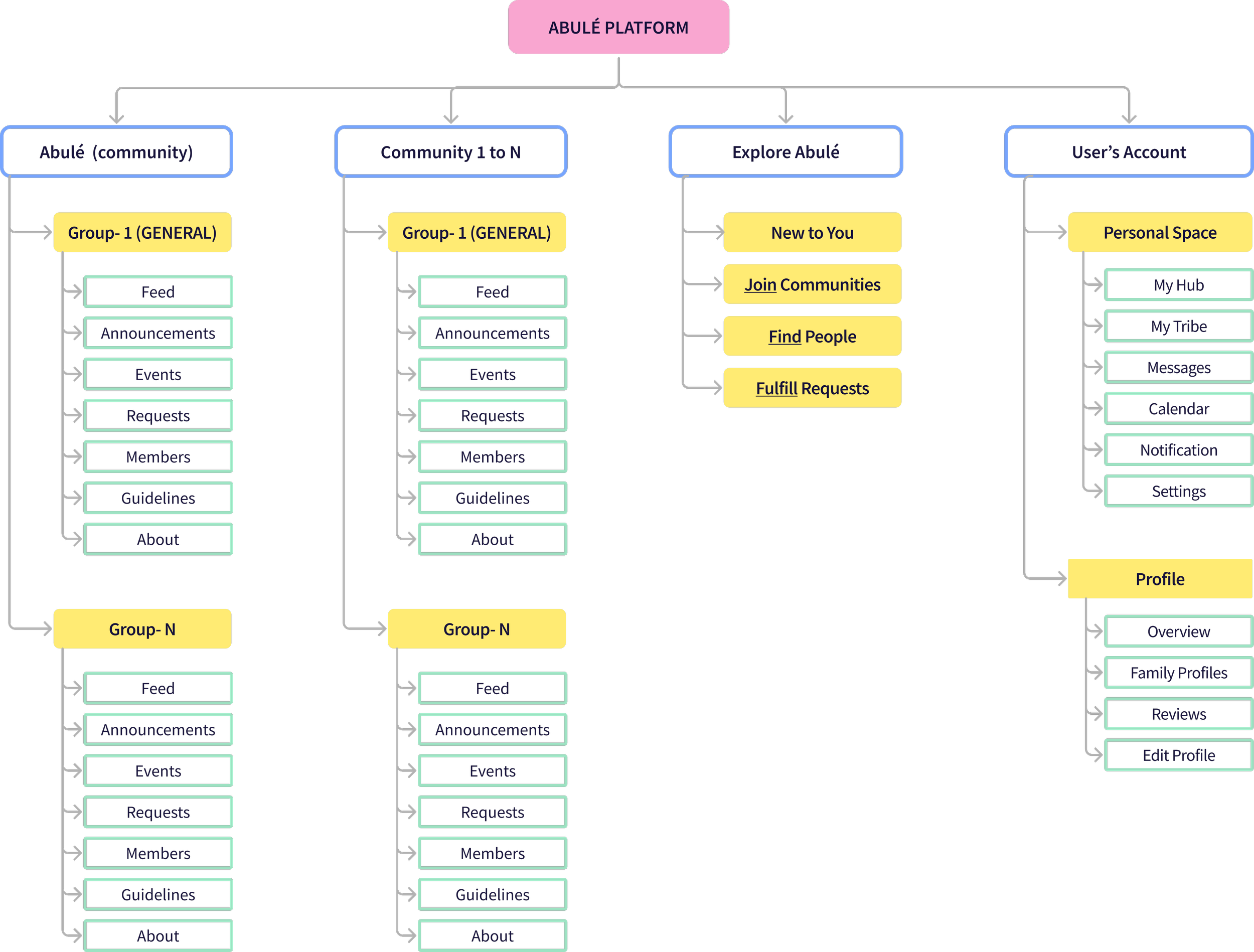
Abulé has a nested structure where Emma (a parent) joins Groups within Communities, all part of the larger Abulé platform.
Hierarchy: Abulé → Community → Groups → Feed, Events, Features
Abulé’s existing navigation didn’t support its nested structure. Group switching was hidden under the community name. Hidden ‘Explore Abulé’, under Feed, was blocking the core value prop- community discovery.
We needed a scalable navigation system that could accommodate growing communities and groups.
problem
- This navigation redesign was foundational for the entire web app.
- Engineering would be blocked on building B2B admin tools (they needed to know where admin controls would live in the IA).
- Sales team couldn't demo the multi-community experience to 20+ enterprise prospects in pipeline.
Without solving this nested hierarchy problem, we couldn't bring product to market.
Challenges


With no budget for new research, I synthesized insights from 4 sources- stakeholders, PMF Research, heuristic analysis, and competitive analysis, to make defensible design decisions.
Let’s Dive In
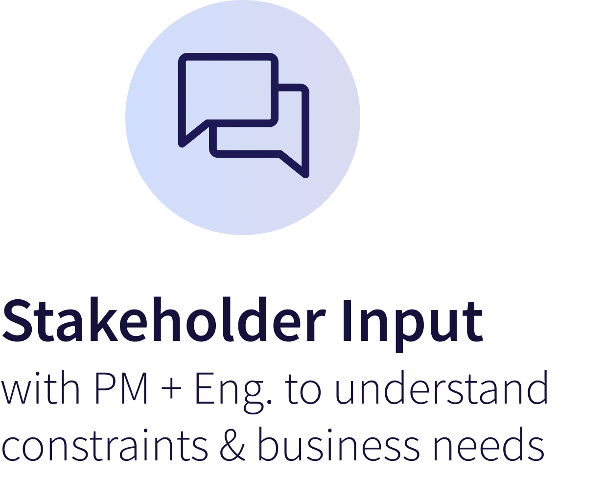

1. Stakeholder Input
Technical Constraints: Use reusable React components; must work across web, mobile, tablet.
Business Requirements: Support both public and private groups, and create a navigation structure that could scale to accommodate future admin features.
2. Product Market Fit
I synthesized insights from 26 interviews and 49 surveys from prior product-market fit research to shape my design principles.
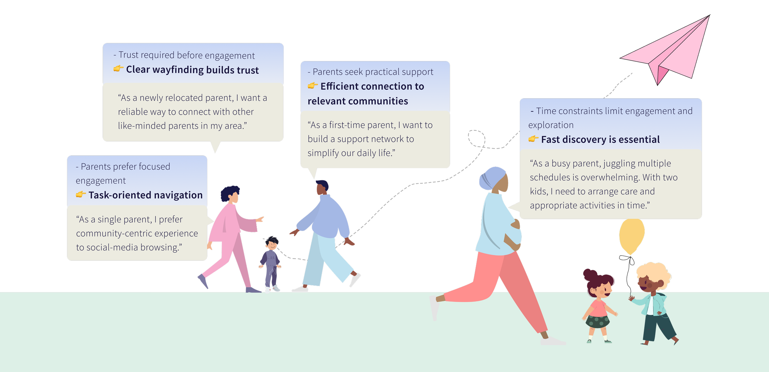
Time constraints limit engagement and exploration. Parents need to accomplish tasks quickly and discover relevant communities effortlessly.
3. Heuristic Analysis
Issue 1: No labels and feedback left users unsure of their current location within nested structures.
Issue 2: Using one interaction to switch between communities and groups forced users to remember navigation paths.
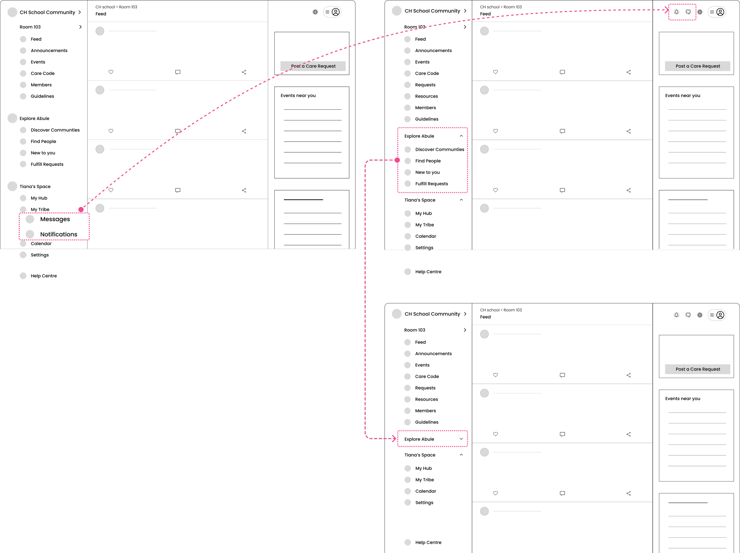
Issue 3: “Explore Abulé,” the entry point to discovering new communities and people, was hidden under the Feed tab, making it inaccessible from other feature pages. Users had to navigate back to Feed to find it, adding friction to a core flow built around community connection.
Emma's experience with the old navigation:
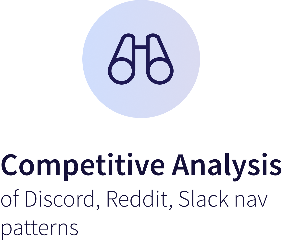
4. Learning from established patterns
I studied how Discord, Reddit, and Slack solve hierarchical navigation for nested communities:
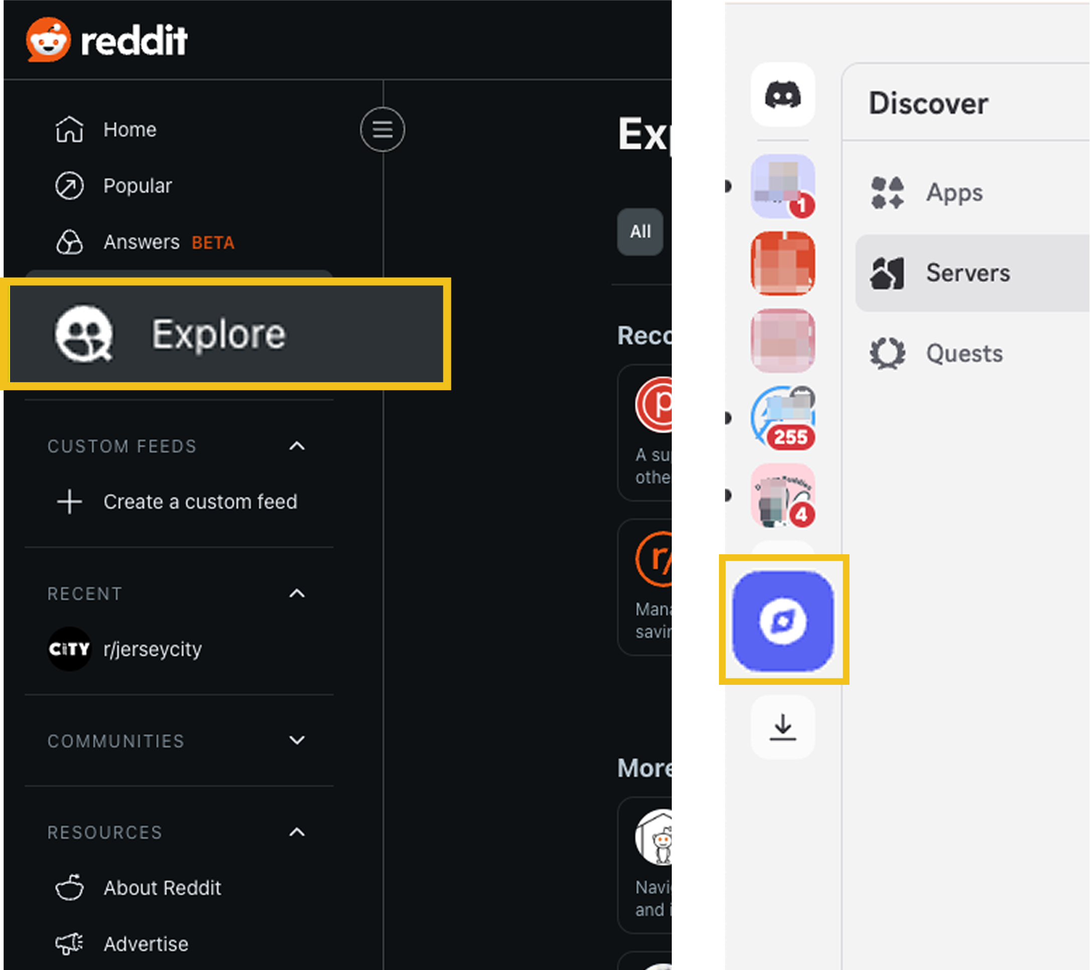
Discord and Reddit place Explore in global navigation for quick discovery of new communities.
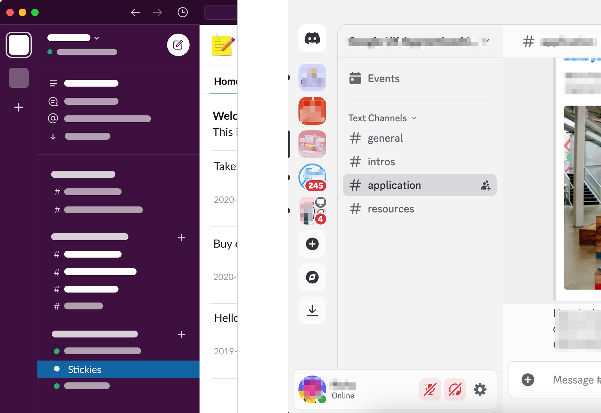
Discord and Slack use hierarchical left-side navigation to enable clear content organization and exploration.
These platforms separate high-level navigation (discovery, switching) from contextual navigation (within a community/server.)
DESIGN PRINCIPLES
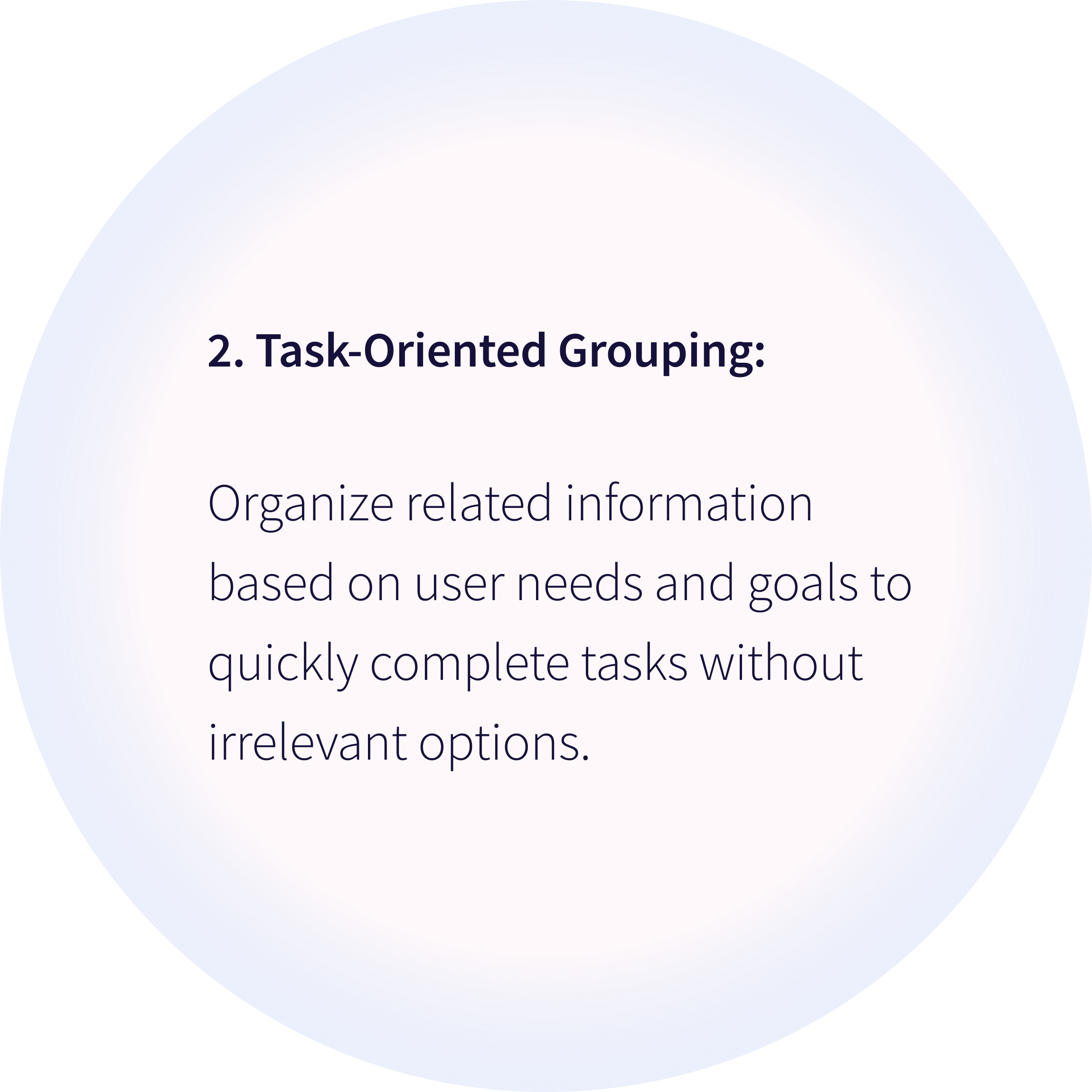
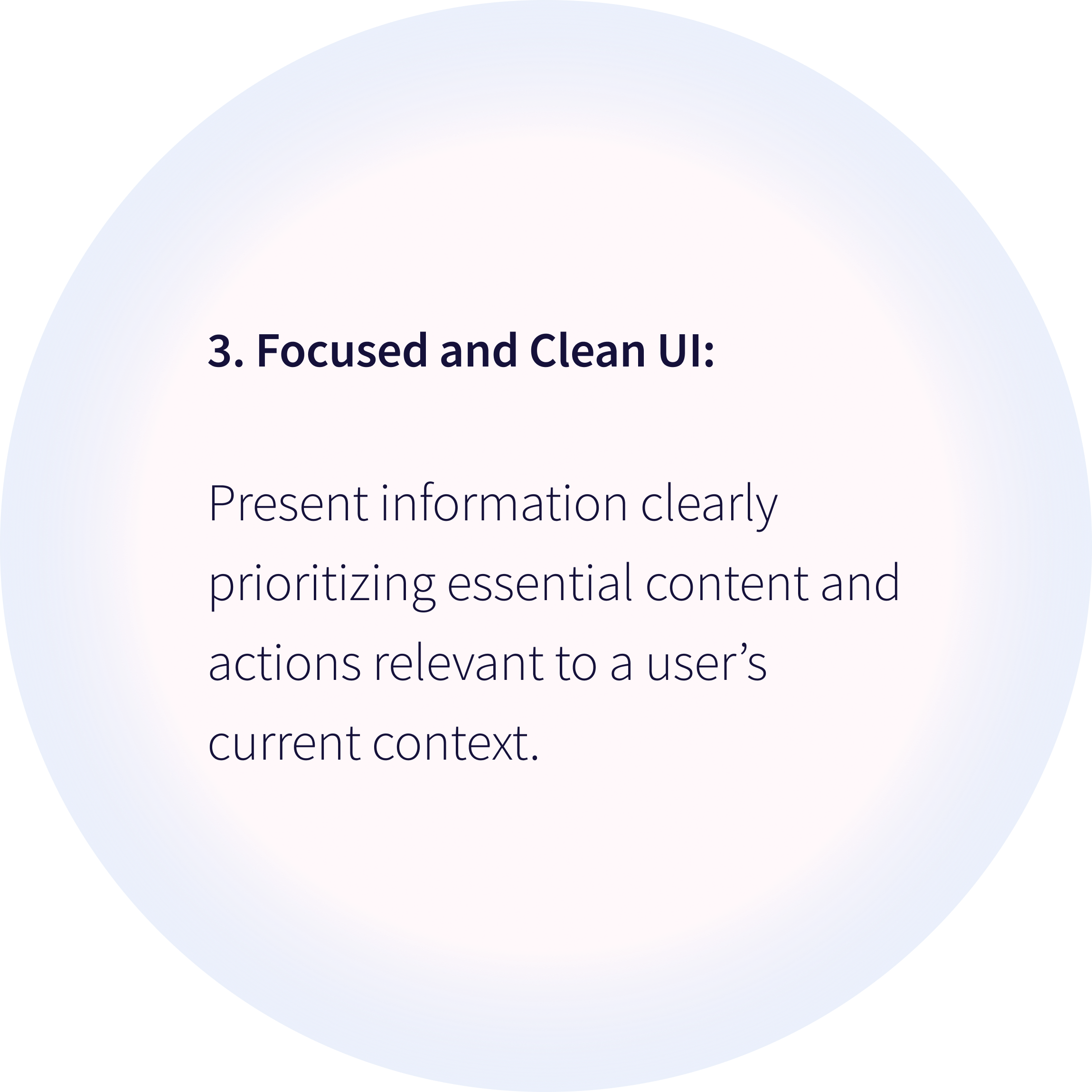
If I separate Explore into top-level navigation and make community switching persistent, users will discover new communities faster, because time-constrained parents need clear, low-effort paths without having to remember where features are hidden.
Hypothesis
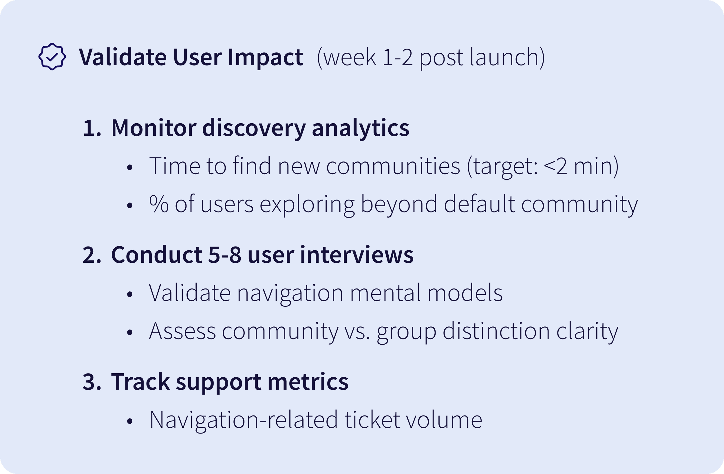
Validation metrics: Time to find new communities (target: <2min) and % of users exploring beyond default community.
Ideation
To align the team, I proposed a scalable IA
Key design decisions:
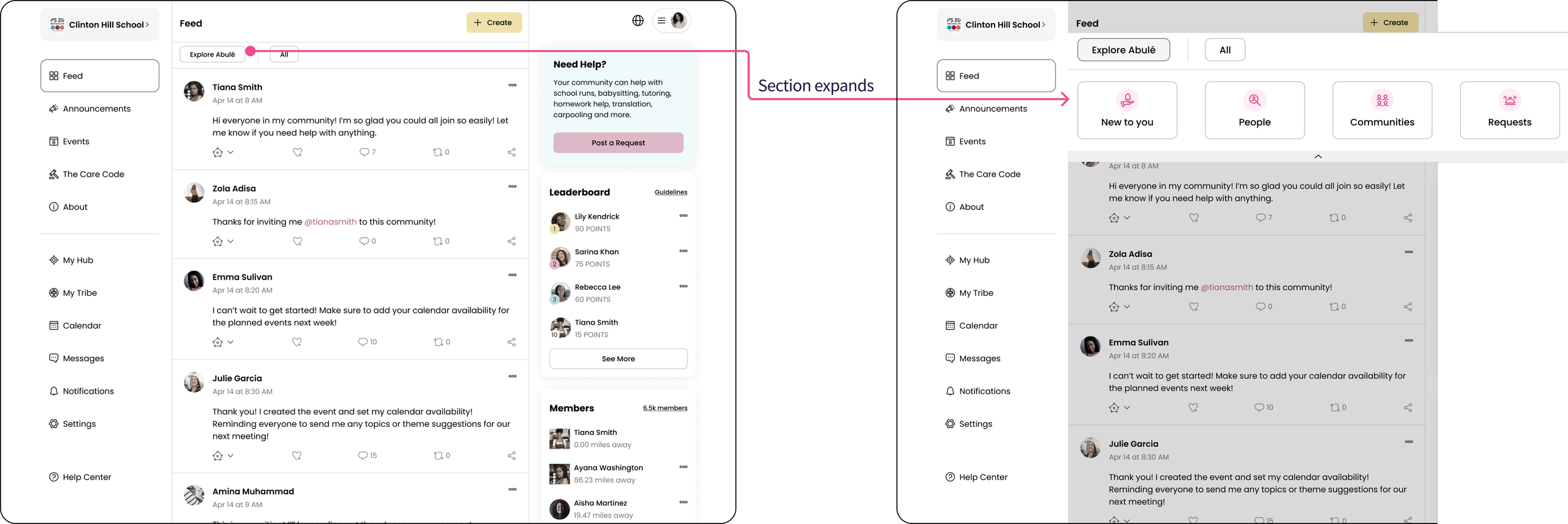
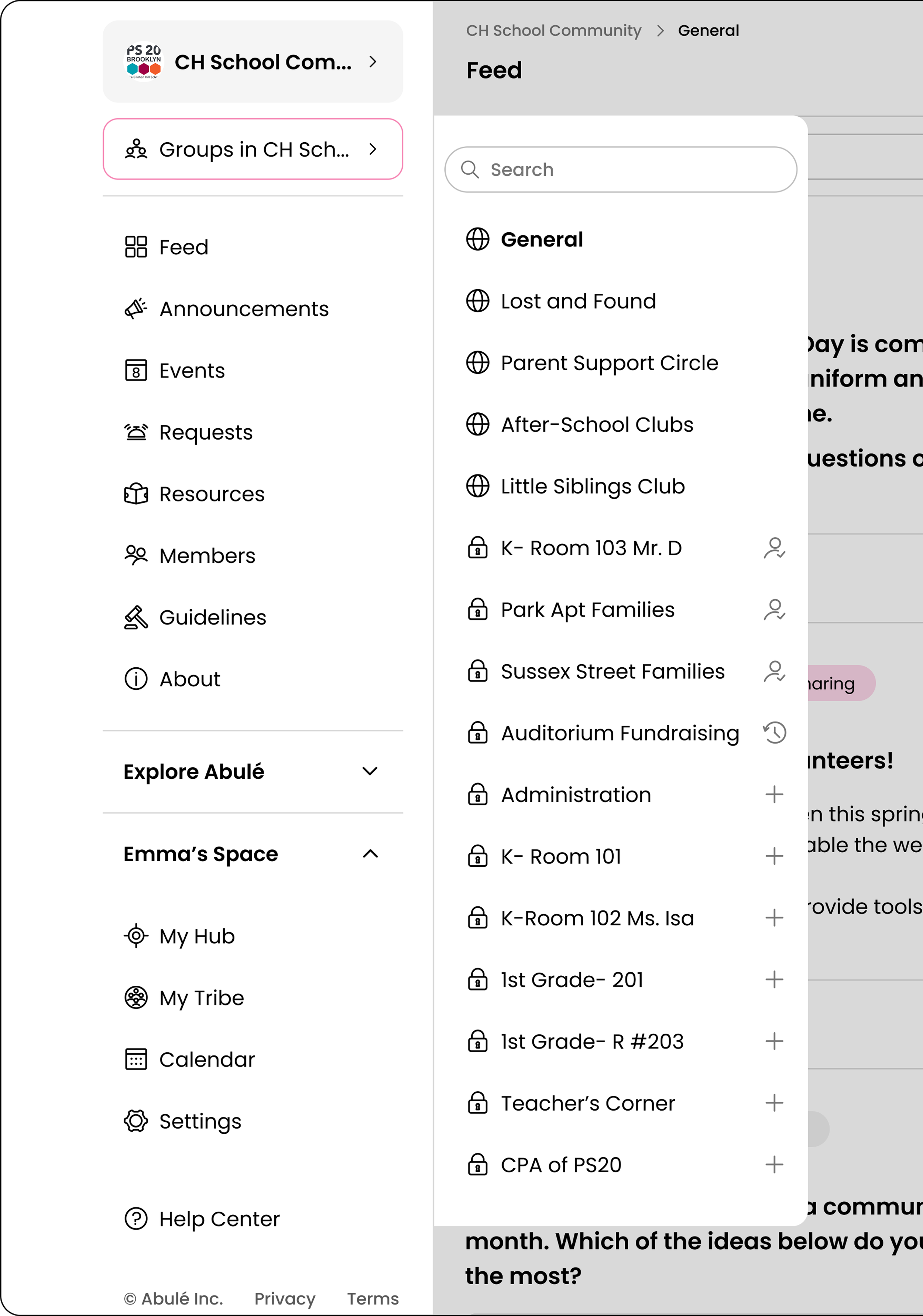
1. Elevated Explore Abulé: Moved from under Feed to a top-level section, making community discovery accessible from anywhere in the app.
2. Default General Group: Since groups can be public or private, I structured each community to include a default public General group, giving all members a shared starting point, similar to how Slack and Discord handle default channels.
3. Abulé as default community: Every user begins in Abulé, a platform-managed community that functions like any other but drives initial engagement and onboarding.
The Founder and Engineering Head aligned on this initial structure but…
I realized the challenge was designing a scalable UI capable of supporting growth from 5 to 500 communities, each with potentially unlimited groups, while elevating Explore Abulé.
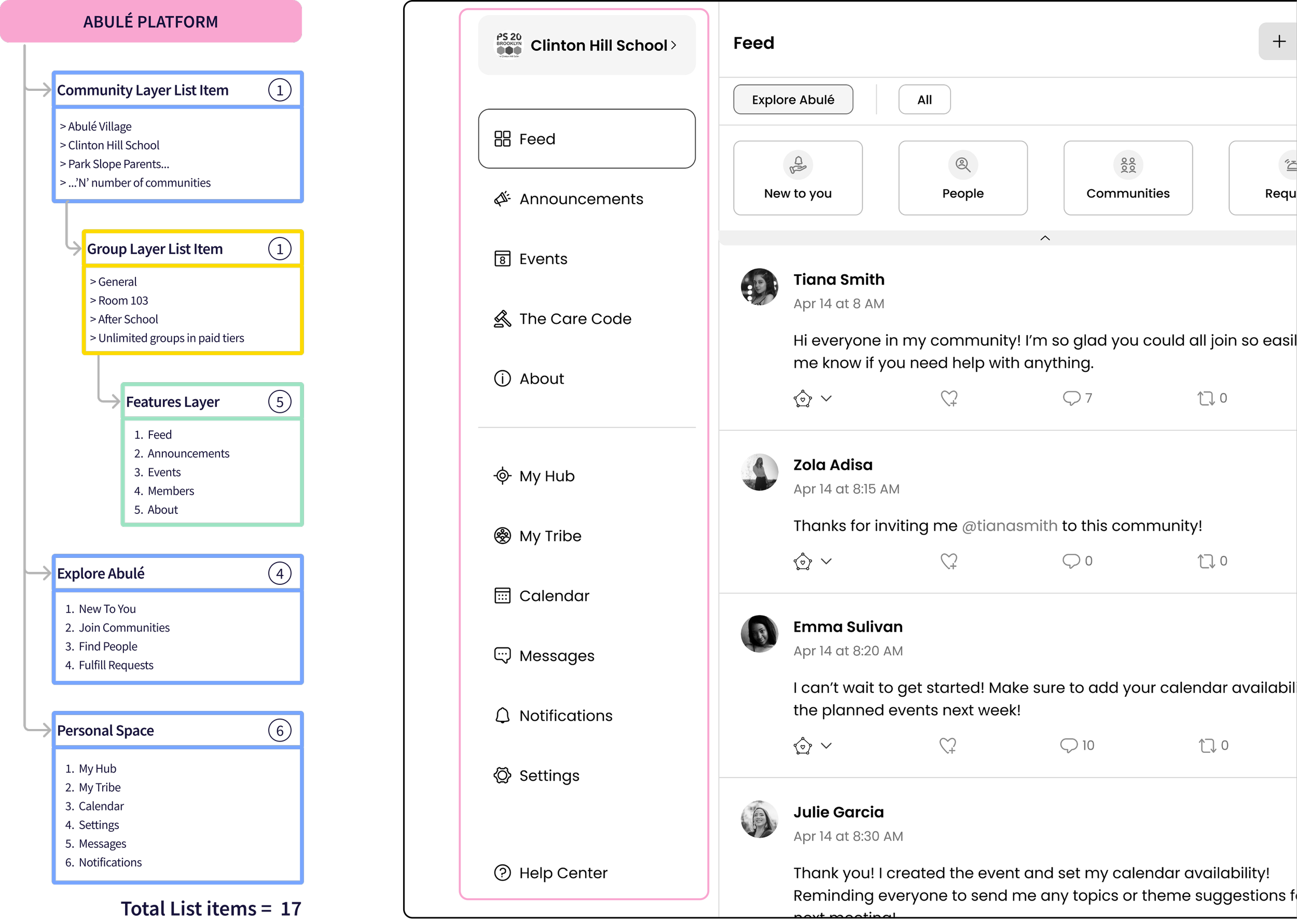
Our target users (time-constrained parents) have a low tolerance for complexity, I set a hard limit- critical navigation must stay above fold without scrolling on typical laptop viewports, which meant:
- 17 labels competing for limited vertical space (typical laptop viewport: ~800-850 px)
- 3-level hierarchy (Community → Groups → Features) + Explore Abulé and Personal Space, where each level needs to stay discoverable without cluttering the primary menu.
Design Explorations
I needed patterns that were infinitely scalable
Exploration 1: Dual Left Navigation
- Primary nav divided into clear segments: Community | Explore Abulé | Personal Space
- Secondary nav: groups and features within selected community
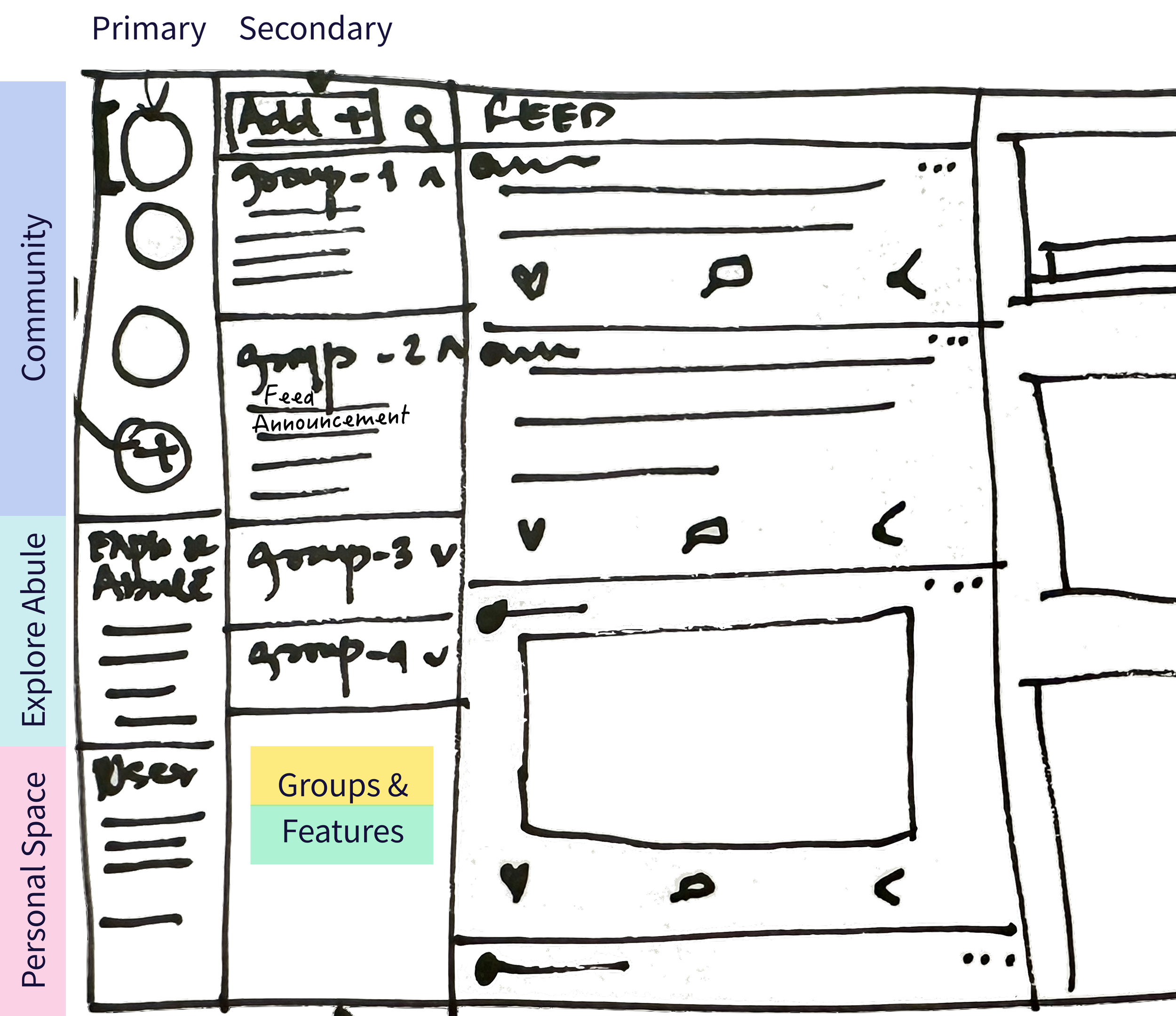
Why it didn’t work:
- Did not scale beyond 3-4 communities & depended on icon recognition.
- Tested this with 9 team members (3 parents, 6 colleagues). 8 out of 9 found the design overwhelming, including all three parents.
- Engineering Lead pointed out building it would be a heavy lift, potentially pushing back our main deadline.
Exploration 2: Navigation with pop-outs
Building on positive feedback about having separate zones for community, exploration, and personal tasks, I explored a single left nav with pop-outs for community and group selection.
What did not work?
- Community switching is a high-level task, showing list items and features during this flow adds visual noise & distracts users.
What worked?
Pop-out for group switching because it:
- Enabled quick and frequent switching without adding visual clutter.
- Scaled easily by keeping the group list scrollable.
- Kept primary nav minimal, fitting most list items above the fold.
Considered trade-off:
- Users can't see all their groups at once which could work for small communities, but I chose pop-out menus to support unlimited groups in paid tiers, reduce clutter, and prioritize long-term scalability.
Exploration 3: Overlay for Community Switching solved this
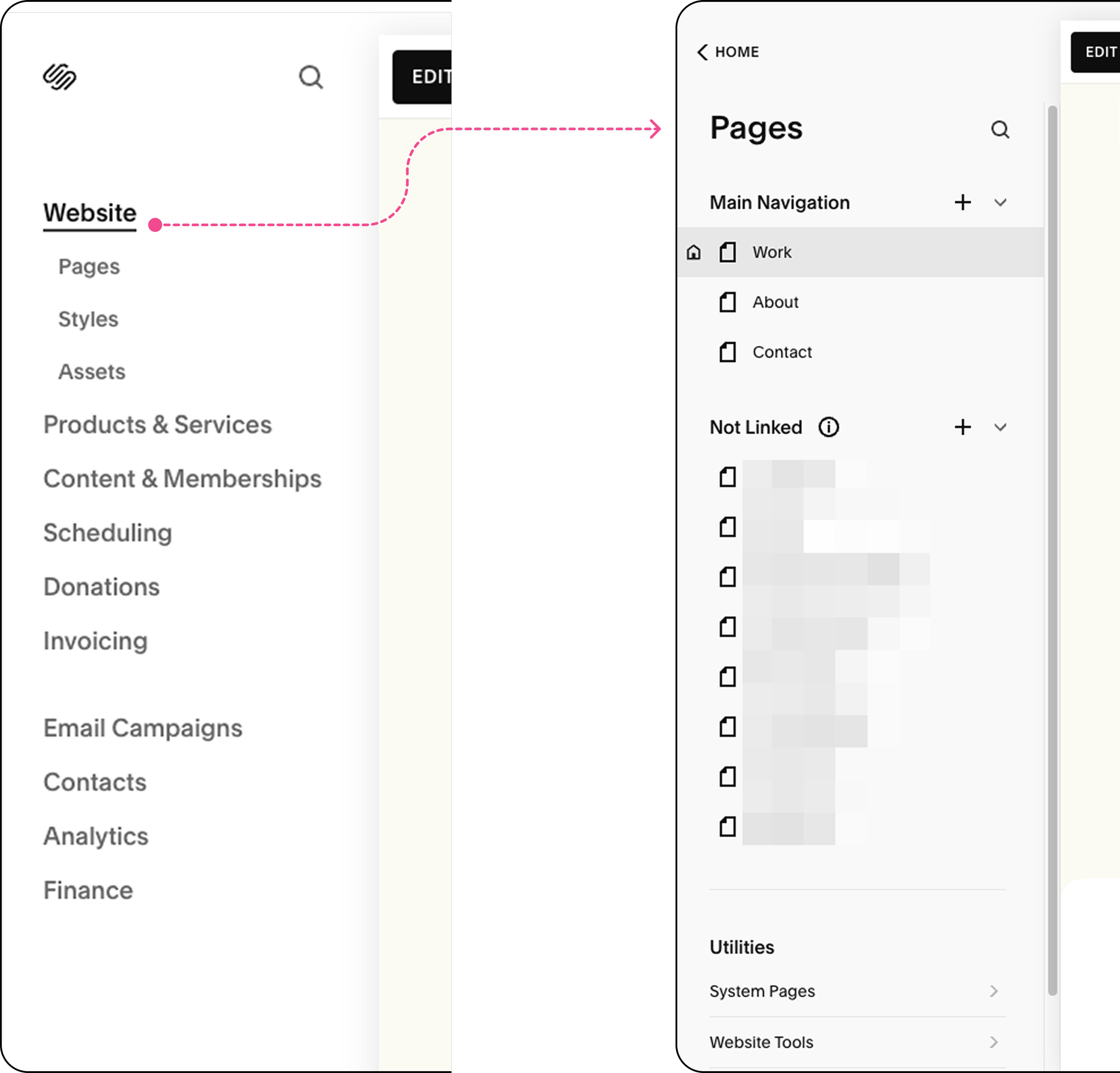
While working on my Squarespace portfolio, I noticed their overlay menu reduced overwhelm compared to hierarchical navigation.
I could focus on one high-level task (like selecting a page) without seeing all the other management options. I adapted this pattern for Abulé's community switching.
Why this worked?
- Isolates high-level tasks: Community selection happens in a focused overlay.
- Infinitely scalable: Works with 5 or 5,000 communities.
- On-demand & intentional: Deep structure only appears when needed.
Small Changes, Big Impact
Messages & Notifications moved to top right
☑️ Aligns with user habits for critical features
☑️ Enables seamless access via drawer from any screen
☑️ Optimized Left Nav Space, keeping main items above the fold
collapsible sections for Explore Abulé & User's Space
☑️ Manages information density while providing flexibility to users to personalize their navigation
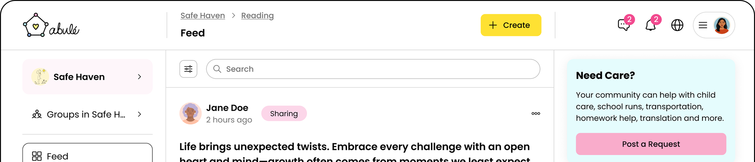
Final Designs
Structured User journey
☑️ Clear separation between Community navigation, Explore Abulé, and User’s Personal Space.
☑️ Every new user begins in the default community, Abulé, managed by platform team.
☑️ From here, users can discover new communities through Explore Abulé.
☑️ Clear visual hierarchy maintained throughout, , with critical navigation items staying above the fold.
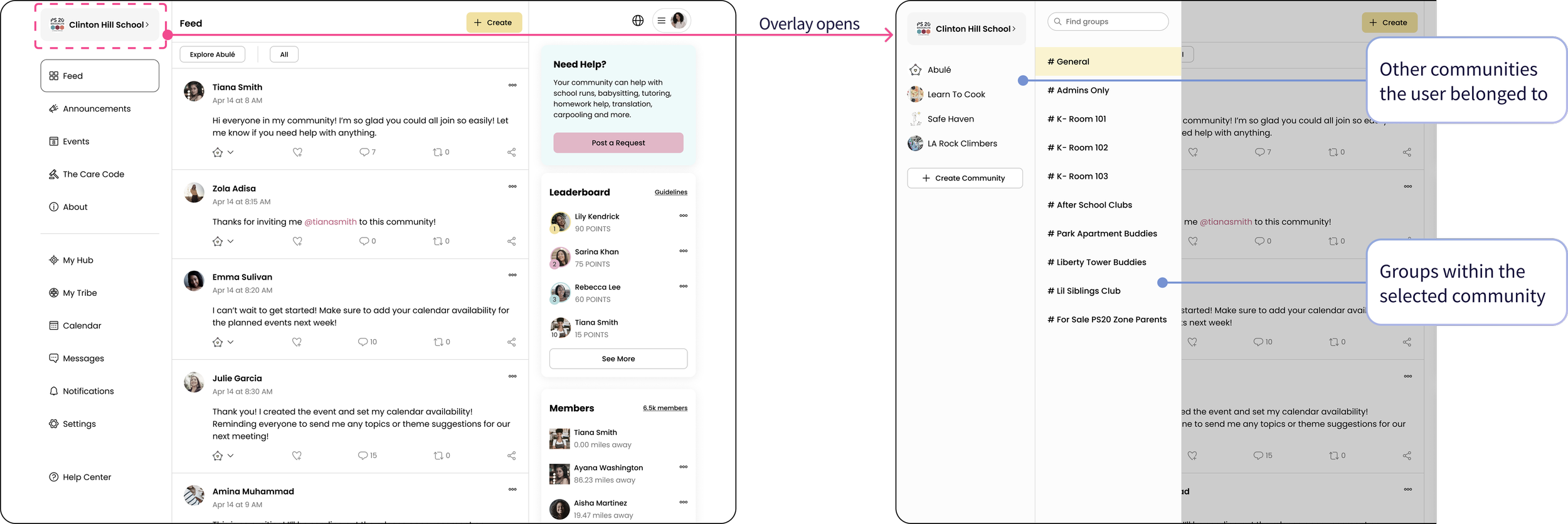
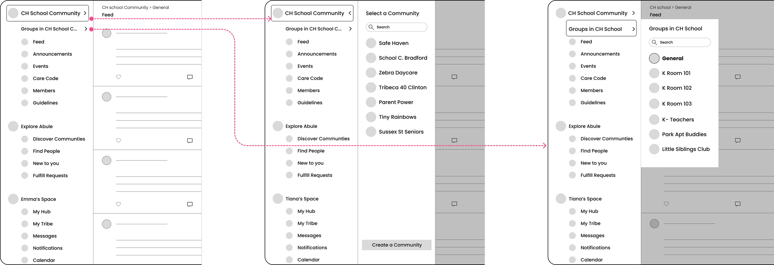
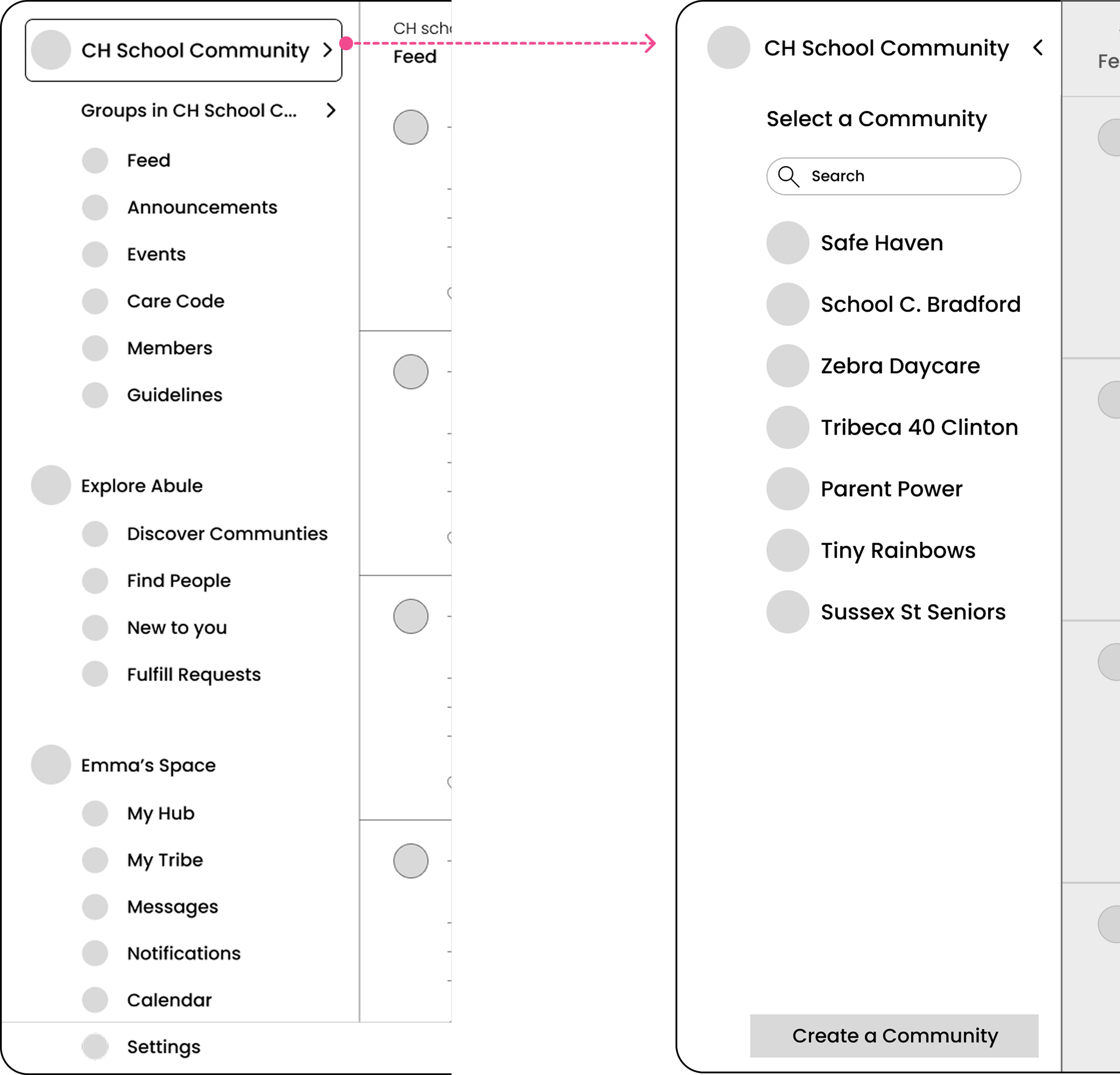
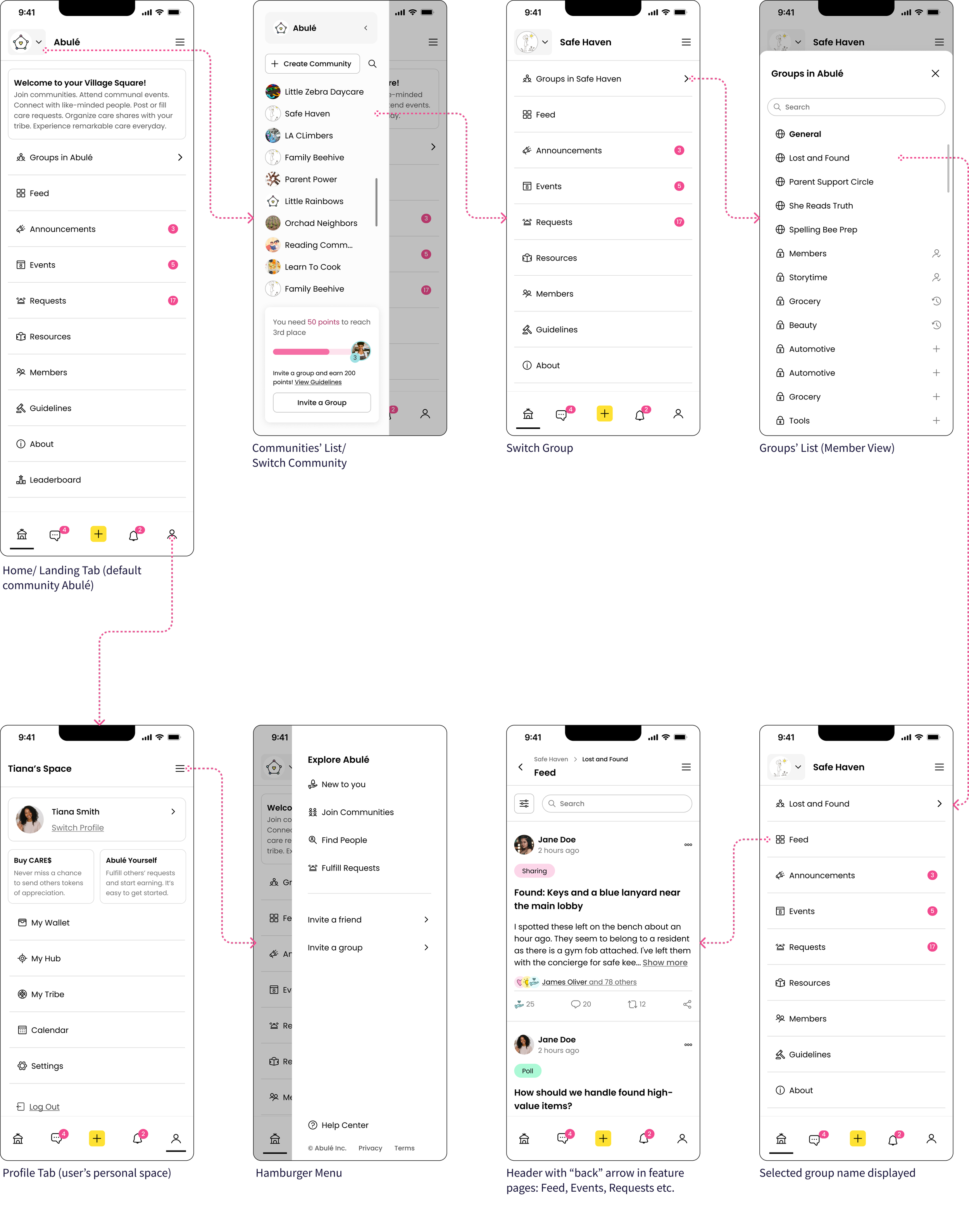
Switching Community
☑️ Users switch communities via the Communities item in the left nav, which opens an overlay for focused, intentional switching.
☑️ Each Community opens to its General Group feed by default.
☑️ Joined communities are organized under 'Your Communities' for quick overview and switching.
☑️ Search and "Create a Community" options available at the top of overlay.
Switching Groups within a Community
☑️ Groups' list item in the left nav reveals a pop-out menu—keeping users in context.
☑️ Groups are organized as:
- Public (e.g. General Group) - shown first
- Private (joined, pending, or available to request) - organized by access level
☑️ Selecting a group updates the feed, breadcrumbs, and left nav highlight to maintain clear wayfinding.
Emma’s Experience with New Navigation
Next, Emma wants to create her own community. This shift from member to creator raised the question:
How might we support members in discovering communities AND seamlessly stepping into admin roles, without creating separate interfaces?
Create a Community flow
What Emma sees as a Member:
Groups with lock icons on private ones
Request to join action
Groups with pending join request
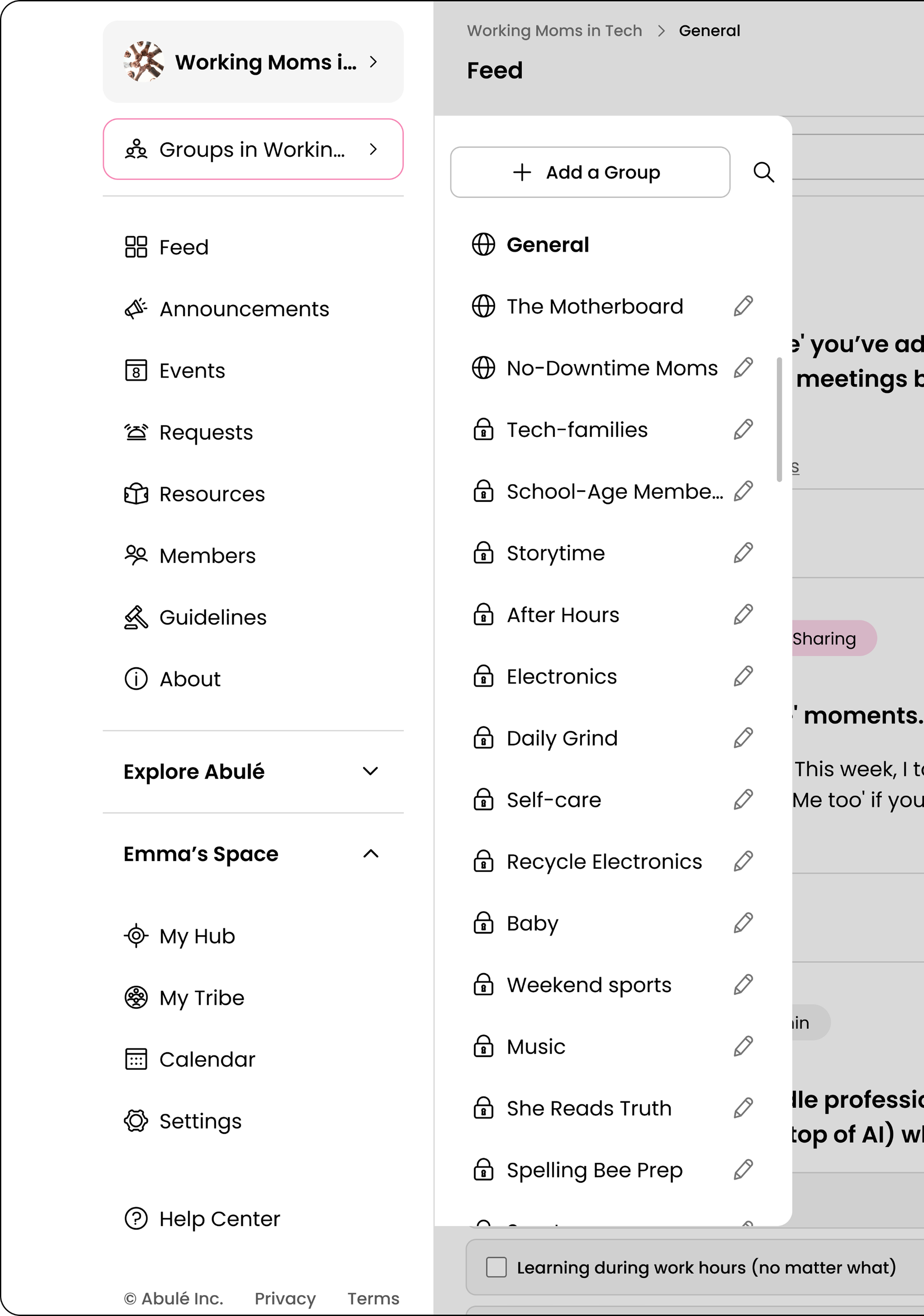
What Emma sees as an Admin:
Same groups in same location
Edit icons on groups
‘Add a Group’ button
Most community creators are also active members (like Emma). Keeping basic creator actions (edit group, add group) inline with member navigation means no context switching for quick edits.
We prioritized desktop first to validate the nested hierarchy and unblock enterprise sales demos. A teammate had started the mobile navigation (establishing the bottom bar and hamburger menu structure) but the implementation needed work. I completed and refined the mobile experience:
Extending The System: Mobile
1. Bottom bar (thumb-friendly primary actions):
- Home, Messages, '+', Notifications, Profile, based on expected frequency of use.
2. Contextual Navigation (Home tab):
- Community switcher, group switcher, and feature tabs, maintaining the desktop's hierarchical structure in a collapsed format. Previously, community switchers appeared on all tabs, even Profile, which didn't make sense.
3. Consolidated personal space (Profile tab):
- All User's Personal Space items (My Hub, My Tribe, Calendar, Settings), grouped by user intent.
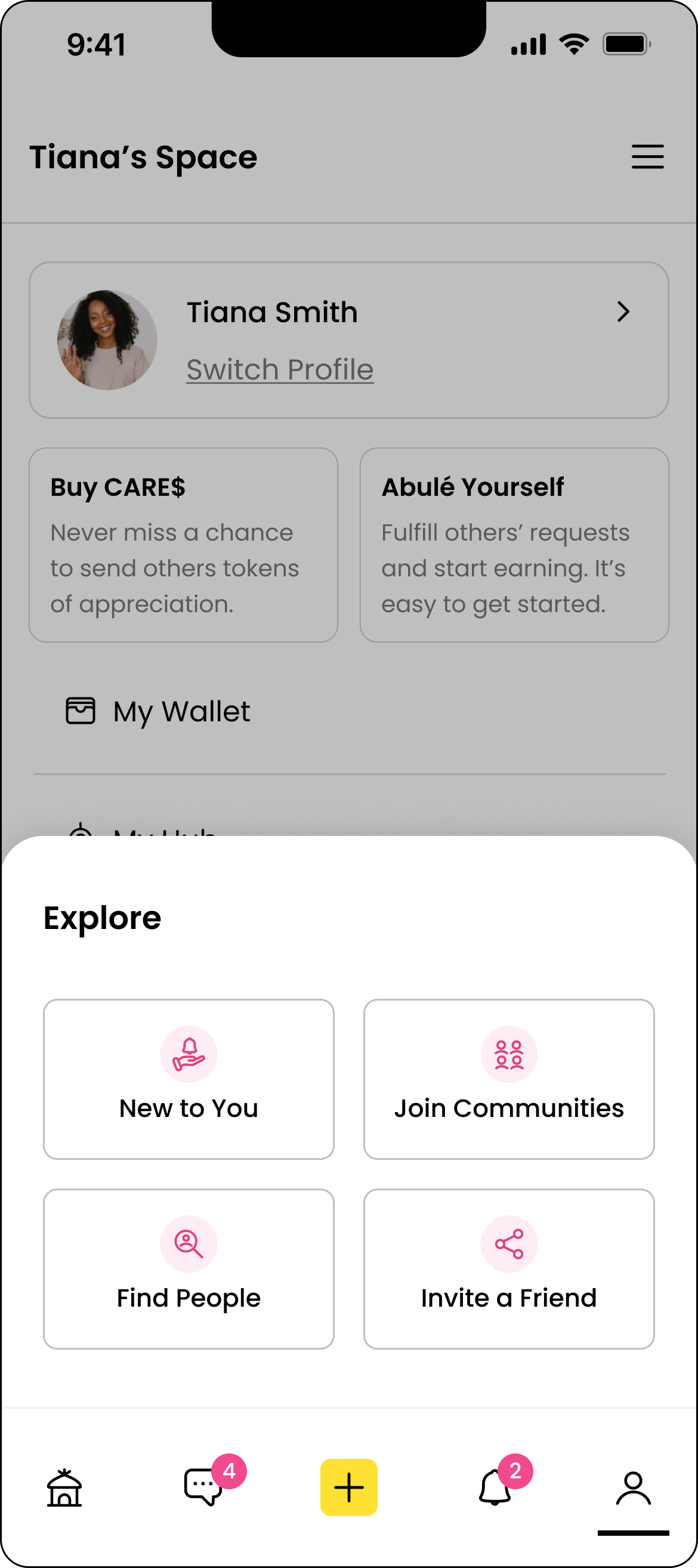
Placing Explore Abulé in the hamburger menu contradicted our goal of elevating discovery; users wouldn't instinctively open a hamburger menu to find new communities. The persistent '+' button presented its own challenge:
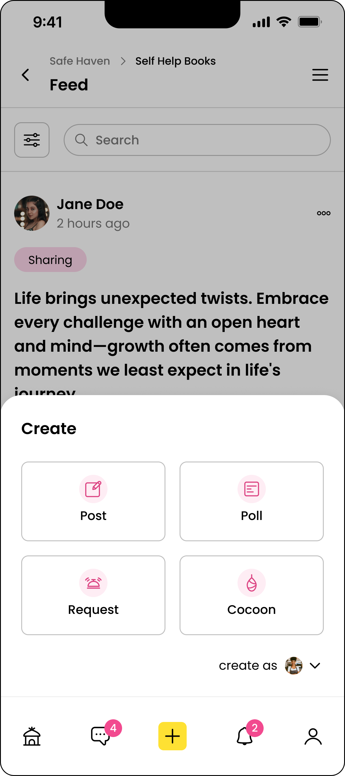
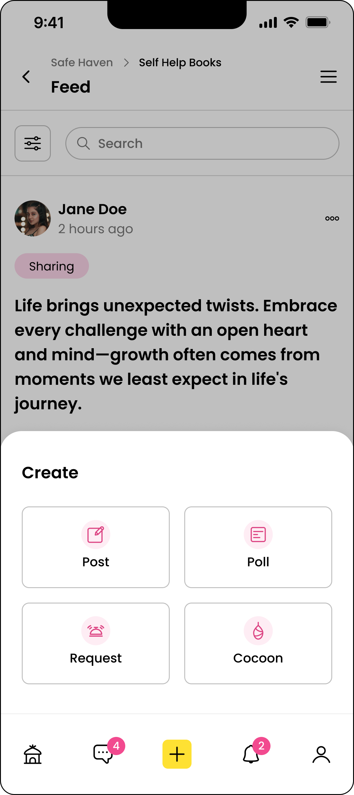
The '+' button sits in the bottom bar, always visible. On Feed, its purpose is clear- create a post but what about Settings, or Profile, or other pages where there's nothing to create?
Enter Contextual Bottom Sheets
The '+' button adapts based on user's current screen making it relevant to the user's current task.
On pages without creation actions, the ‘+’ button provides Explore Abulé features, helping users discover new communities and people easily.
On Feed: ‘+’ creates a Post, Poll, and Request, & Cocoon (future)
On Feed if the user is an admin as well
On Profile or any non-creation page: Explore Abulé actions.
Over the course of 2-3 weeks, I defended user needs in a fast-paced, launch-driven startup environment, balancing usability with business urgency. I leveraged design systems and Figma auto-layouts to enable rapid iteration and efficient delivery.
Outcome & Impact
What I delivered:
Responsive information architecture that supports unlimited communities and groups.
Final high-fidelity designs for all navigation states (default community, community switch, group switch), including role-based (members, admins) views and interaction patterns for desktop and mobile.
Navigation components and annotated specs for engineering, including role-based affordances.
Stakeholder alignment artifacts: IA diagrams, user journeys, and design iterations with feedback.
Impact:


The product has not yet launched, so I cannot validate user-facing metrics. However, the delivered design and its downstream impact demonstrate the strategic value of solving the IA scalability challenge.
Next Steps
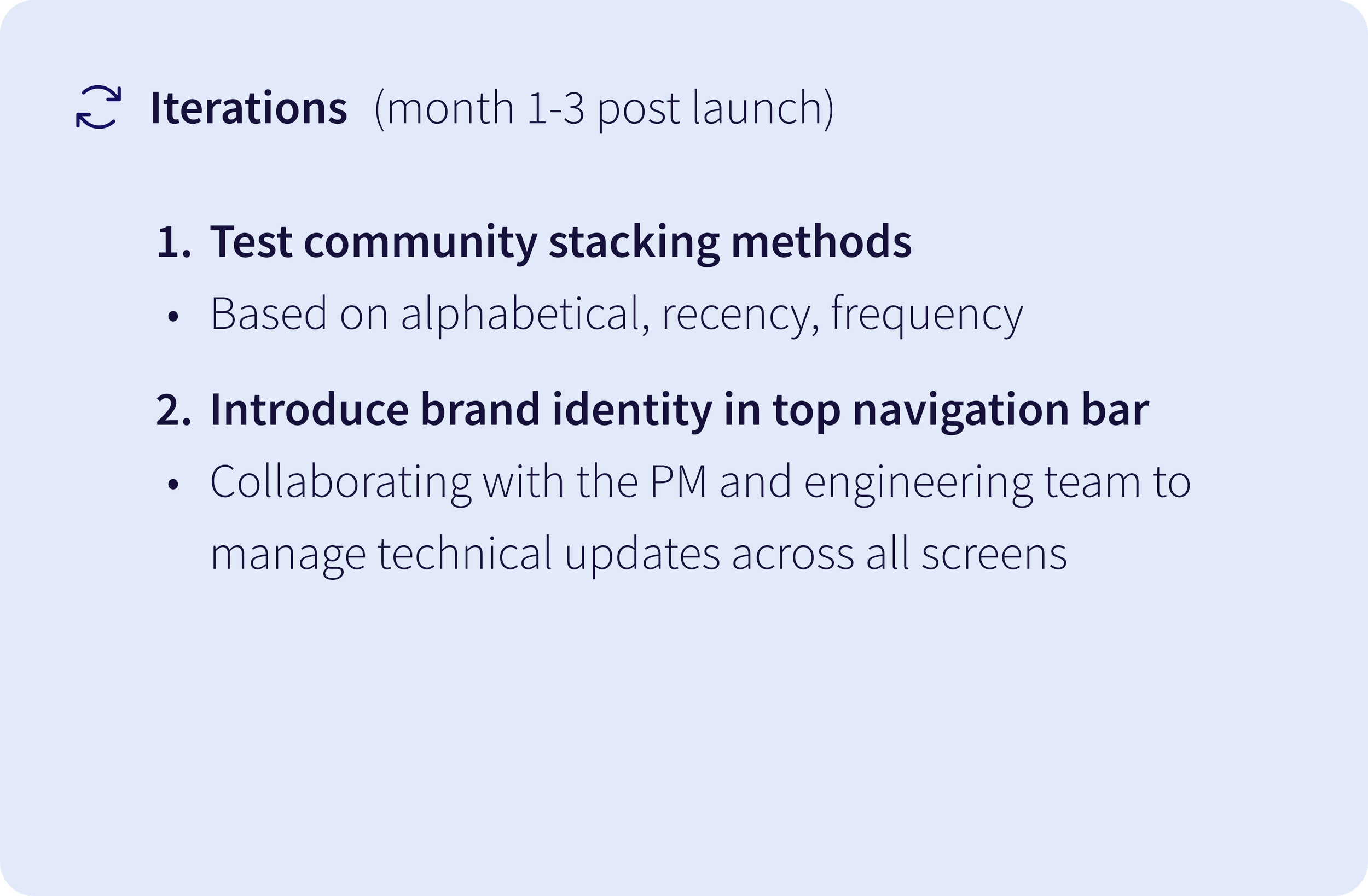
1. Cross-functional collaboration under tight timelines:
Working on navigation demanded rapidly building context and making strategic trade-offs. I quickly understood the B2B web app architecture by connecting regularly with the PM and engineers. I learnt how to balance user needs with the urgency to ship fast. At times, I advocated for user-friendly alternatives (e.g., keeping private groups visible with request-to-join instead of hidden), while other times I prioritized what could ship quickly, focusing on clarity and consistency with plans to iterate post-launch.
Reflections
2. Designing defensibly without formal research:
I learned to leverage existing insights (PMF research, heuristics, competitive patterns) to make defensible design decisions under tight constraints. While I documented and discussed assumptions regularly with the PM, I realized that visualizing them early in a shared FigJam could have potentially secured time and budget for research.
3. Using feedback for sharper iterations:
While I gathered feedback from teammates (who are close to our target users, parents), if I had more time, I would have run quick 3-in-30 usability tests on the community-switching overlay pattern to uncover any key issues earlier, leading to sharper iterations before full implementation.